Case study
Supercharging the higher education publisher experience
With ambitions to create a pillar for advancing their brand and institution, we partnered with the Harvard Gazette to deliver a platform and design system built to evolve.

Industry
Services
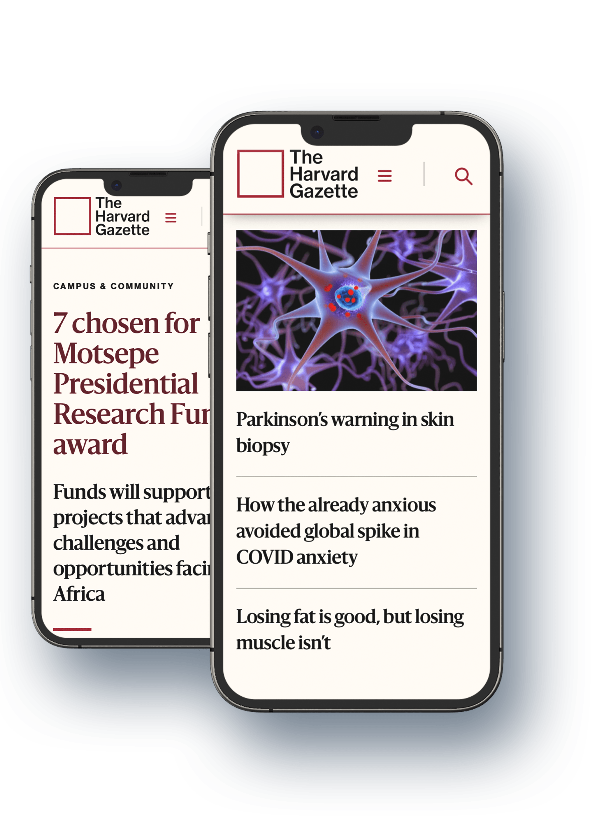
1. About the Harvard Gazette
First established in 1906 and moving online in 2010, the Harvard Gazette serves as the official news source for Harvard University. It covers a wide range of topics, including university announcements, interviews with professors, scientific research, community news, and even updates on Remy, the campus cat.
The Harvard Gazette sends out a daily email to more than 300,000 subscribers and offers a section called News+, where publishers from different Harvard schools can share their stories with a broader audience.
2. Design systems for brand engagement
The Harvard Public Affairs and Communications team were looking for an updated design system for The Gazette and its daily email newsletter, and were considering fresh approaches for how to best reach their audiences.
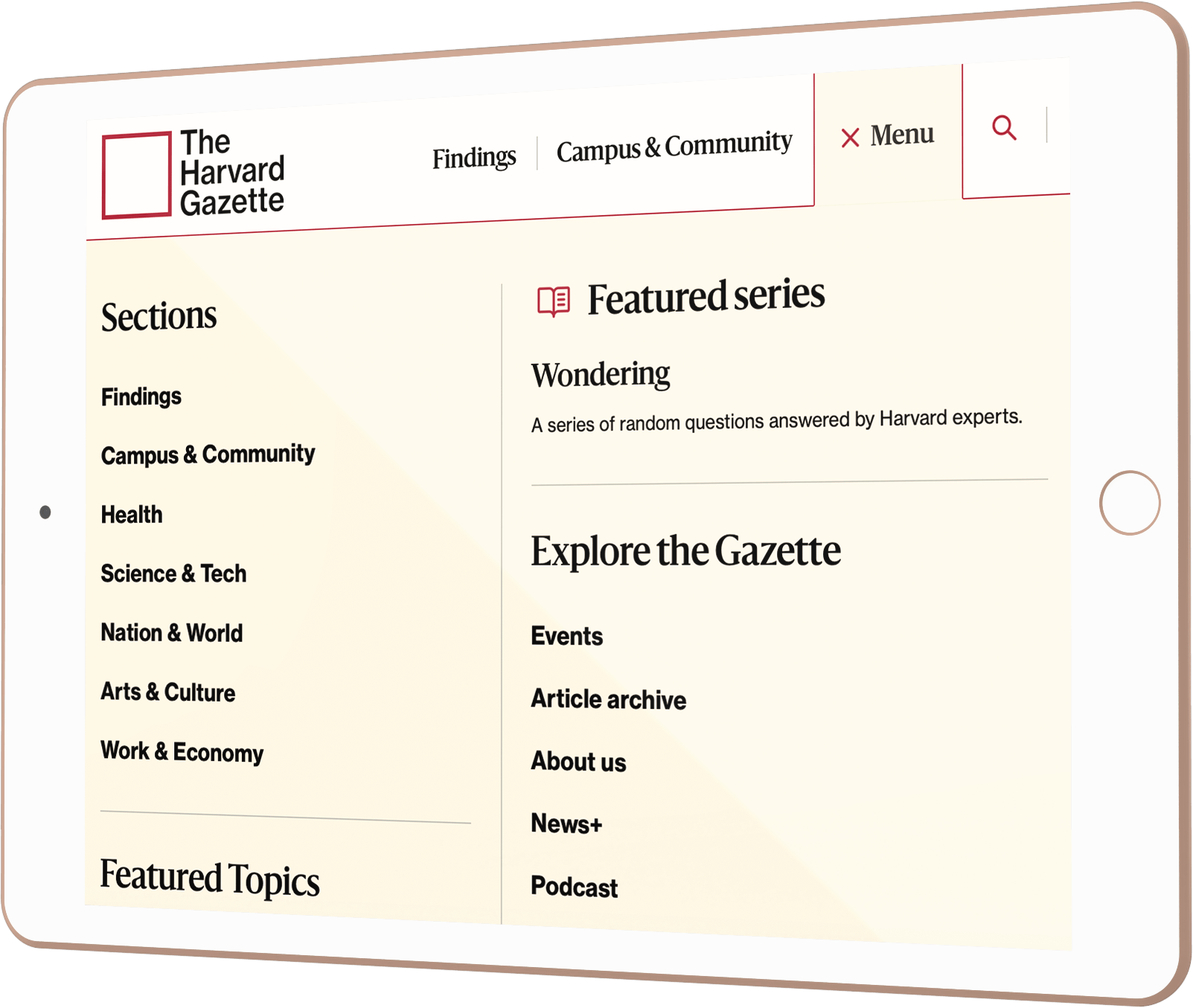
They wanted to explore new ways of thinking about how to organise and showcase their content, and develop a high-level content strategy to better serve their mission and stakeholders. Through intuitive navigation and compelling layouts, the team wanted the new user experience to showcase new and engaging content to diverse audiences in a way that aligned with their key institutional priorities.
With a high-profile brand like Harvard’s, it would be important to investigate and understand how the brand was perceived through their content before creating an innovative design system that would be both beautiful and accessible.

This project is an amazing example of how a true partnership between a client and the delivery team is a formula not only for success, but for an incredible and enjoyable journey throughout a long and sometimes challenging project.”

Cheryl Stukey, Project Manager/Scrum Master, Human Made
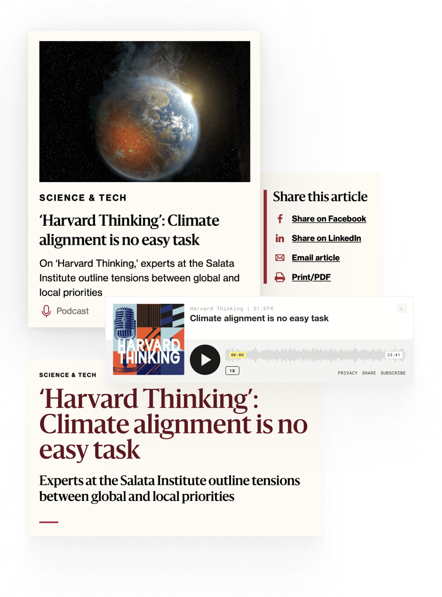
3. Keeping users at the heart of the project: UX, UI & accessibility
Editorial users and audiences were up front and centre from the very start.
The team wanted to move away from the WordPress classic editor and toward using Gutenberg blocks for bespoke layouts, empowering editorial users to create a wider variety of stunning designs quickly and easily. The site was also required to meet or exceed WCAG 2.1 accessibility requirements, ensuring that every user was able to enjoy the Gazette’s content seamlessly.
And with over 25,000 pieces of content, some dating back to the late 1990s, the Harvard Gazette project was no small task for the teams involved.
- 1.3 million page views per month
- 300K+ subscribers
- 250 newsletters published per year
- Approximately 75 million newsletters sent per year
- 667+ new stories and articles submitted by Harvard writers and editors annually
4. Collaborative agile partnership
We worked closely with the team over at Harvard for the entirety of the project, as well as our design partner Furthermore. The Human Made team was looked to as trusted advisors, and very quickly formed a true partnership with the Harvard team.
Human Made worked hand-in-hand with the Harvard team to manage scope, create clarity and clear direction for the work that was being done, and to pivot when necessary to ensure that the initial launch would meet or exceed all of the ‘must have’ requirements.
Scope and velocity projection models were continually reviewed with the Harvard team through the project. A collaborative effort between Human Made and Harvard was conducted via working sessions to adjust the remaining scope to align with the available velocity, ensuring both teams were aligned and working as one throughout.
5. To Gutenberg and beyond
Having conducted on-site workshops at Harvard to make sure we were fully on top of the Gazette team’s vision, designs were completed and approved before foundational work began and the front-end theme was created.
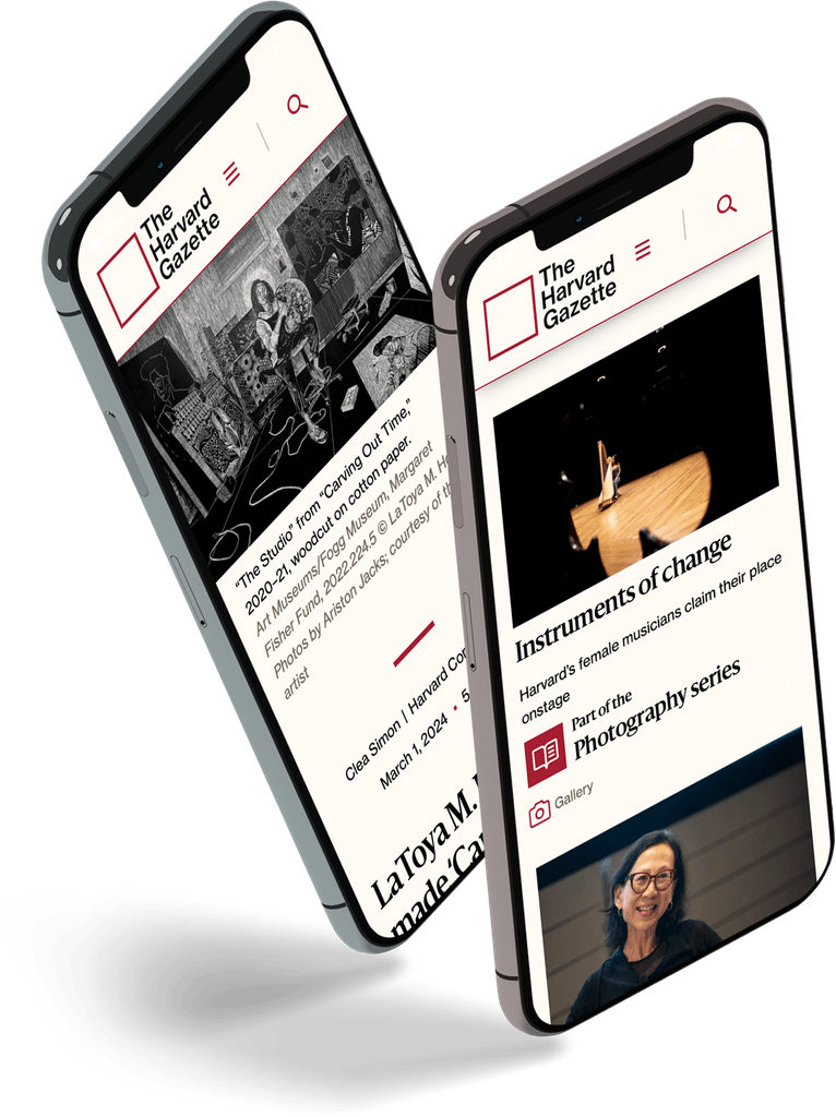
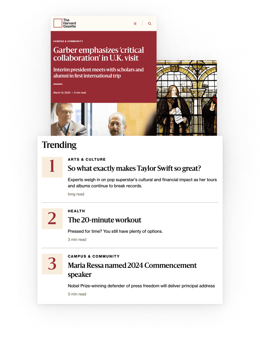
Brand new article page templates and blocks were built to ensure maximum flexibility for editorial teams, while still providing guardrails and ensuring full adherence to brand guidelines.
- 5 of the core blocks extended
- 13 block patterns, including several media gallery layouts
- 6 archive template layouts
- 33 custom blocks
- 6 block styles for the article header block
6. Accessible, beautiful, efficient: the new Harvard Gazette
The project culminated in a total redesign of the Harvard Gazette site, and was entirely focused on improved UX, UI, and accessibility. The enhanced usability of the site, coupled with performance improvements, means the Harvard Gazette site is ready to help the Harvard teams continue reaching their aims and delivering the stories that matter most to their audience communities.

Through working hand-in-hand with the Harvard Public Affairs and Communications team from kickoff to launch, we were able to deliver a supercharged publisher experience and improved user experience thanks to the creation of a much more user-friendly publishing interface.
An enhanced and streamlined publishing workflow was made possible by using Gutenberg blocks and block patterns as the foundational building components. What’s more, our strict adherence to WGAC 2.1 accessibility requirements means every user will have a seamless experience, exactly as it should be.
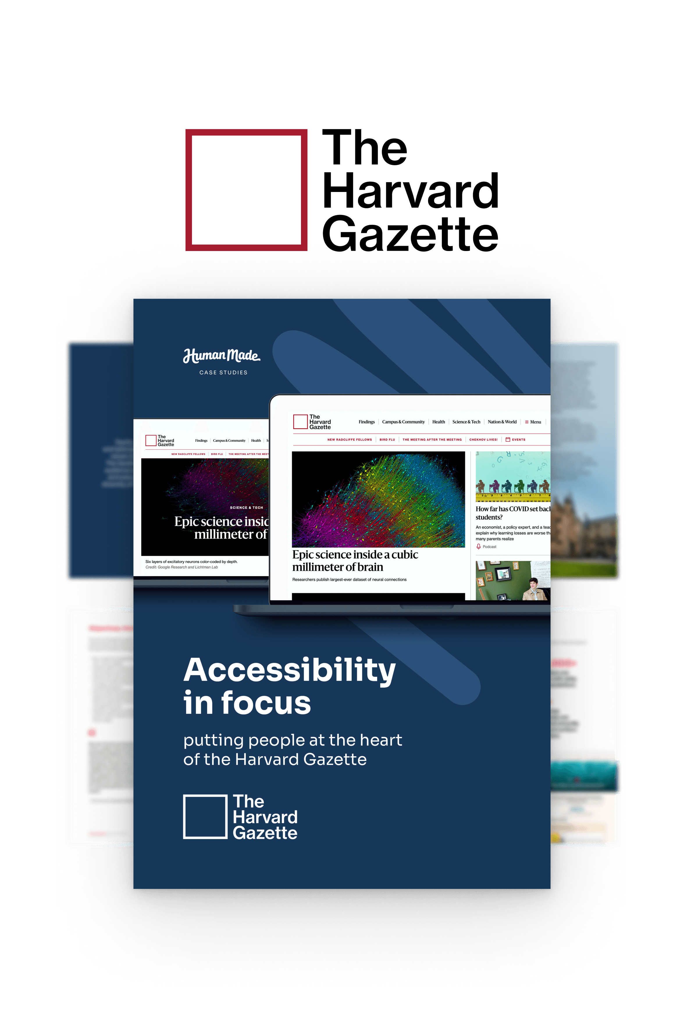
Download the full Harvard Gazette case study
Get behind the scenes and see how the Human Made and Harvard Gazette partnership achieved digital excellence.
See our work
View all case studiesWork with us on your next project
Shoot us an email at sales@humanmade.com or complete the form below.


