Gutenberg is an ambitious project that aims to completely overhaul the experience of writing content in WordPress. It brings big changes to the edit post screen, but will also bring big changes to the way we design, develop and think about WordPress. And this new feature is due to arrive in the next release of WordPress, which could be just a few months away.
For most of our new client projects, we’re working to at least a 3/4 month timeline. Which means that for us, anything currently in the planning stages needs to seriously consider Gutenberg if it is to avoid being out of date as soon as the site goes live.
I wanted to get in some practice, and adding compatibility to humanmade.com seemed like the perfect test project, and I had a few days free before my Christmas holidays in which to have a go.
So what did I need to do?
- The blog side of the site was pretty standard WordPress. A simple template with a sidebar, and a few custom shortcodes. We actually enabled Gutenberg for posts only a couple of months ago without
many problems. I’d need to add a few custom blocks for our shortcodes as the UI for them (previously using Shortcake) was no longer working. - Pages were a bit more complex. The template is a full-width design and we used a custom page builder plugin to manage the content. I expect this to be a bit harder, but I’m aiming to recreate some of the more visual page builder plugins that clients often ask about.
- Projects are a custom post type and also used the page builder, but the layout is a little more complex. I decided to skip these for now, and will tackle them at a later date.
- Meta boxes. We don’t really use these at all so I didn’t need to worry too much.
- Migration. I would need to convert all the data from the old page builder into a format understood by the new Gutenberg blocks.
How did it go?
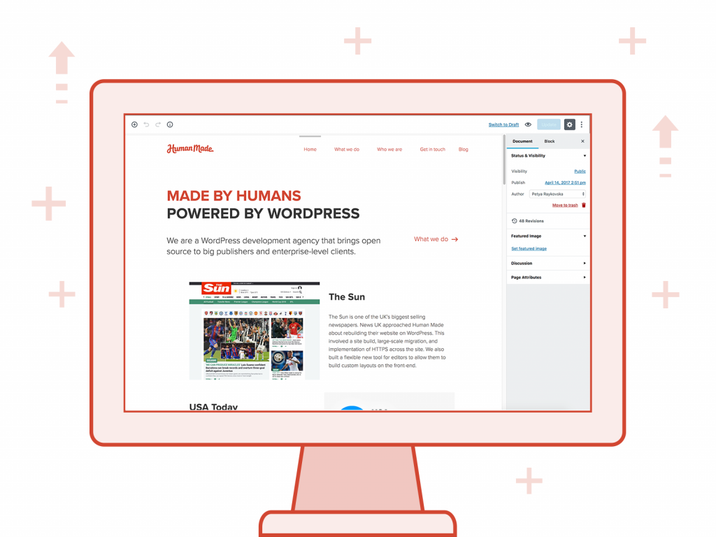
I’m pretty pleased with how its all working. I have built 13 custom blocks, and created a UI for editing them that reflects how they will look on the front end of the site. I have written a CLI script to migrate the old data and turn it into Gutenberg blocks. And this is now live for all posts and pages on the Human Made site. Here is a video that shows what the editor looks like when editing a page.
Editor styles
I needed to include some theme styles so that my new blocks looked OK whilst editing. To do this I created a new stylesheet, loaded in the editor, which included some typography, custom styles, but also included sass files for individual blocks. It was a bit tricky to get this working well.
- The classic editor uses an iframe so the styles are sandboxed from the rest of the page. This isn’t the case with Gutenberg, and I had to rewrite/rework/duplicate a lot of styles to prevent them interfering with the admin styles. Perhaps if I was writing the CSS from scratch I could use a class to namespace my styles and prevent this?
- Gutenberg has styles for core things like lists, but they conflicted with my CSS. It would be nice if this was separated from the Gutenberg interface styles, and I could easily remove them when I provide my own.
- Gutenberg has quite a bit of scaffolding markup that you don’t get on the front end. This has its own margins/padding, and prevents other margins collapsing. This made it hard to get the vertical spacing of my blocks the same as they are on the front end.
Despite my complaints, I got things looking pretty good in just a few hours. Not identical to the front end, but close enough and I am very happy with the results. I don’t necessarily think you should aim for your editor to look exactly as it will on the front end, but I think some similarity is helpful and it’s worth putting in a bit of effort here.
PHP templates for blocks
Our old page builder plugin had PHP templates and I was keen to reuse them. Generally I prefer to avoid storing markup in the post content as it makes it very difficult to change later. When you have 100k posts, simply editing a PHP template is far easier than writing a migration script.
Gutenberg doesn’t force you to render your block in JavaScript. Instead, you can register the block in PHP and specify a render callback function. Initially I was concerned about splitting or duplicating logic between JavaScript and PHP, but this wasn’t that bad and actually, I think I prefer keeping the editing UI separate from the rendered output. The edit component for some blocks became quite complex and diverged significantly from what we actually wanted
This does mean we’re relying on the whole data as JSON in HTML comments thing for storing block data, which I’m not a huge fan of. I’m not too concerned about this though. Gutenberg provides APIs for interacting with the data as ‘blocks’ so I don’t need to care too much how it’s stored.
There have also been several discussions on Github around the advantages of registering blocks server side as this is useful for things like API/CLI interactions.
I suspect that for a lot of the client work we do, Gutenberg won’t actually change things that much. We’ll continue as we are currently, and have our templates in PHP. But for plugins that may be enabled/disbled, I do think storing the data as HTML is nicer as the markup will still be there when the plugin is disabled.
Nested Blocks / Multiline Editable
I managed to avoid having to worry about nested blocks and just used multi-line editable components instead. But these are quite restrictive, and it did mean that I had to adjust some of my content to fit. I suspect people will run into the need for nested blocks sooner rather than later.
If you wanted to build a simple block with two columns, and those columns supported a limited set of child blocks (e.g. headings, paragraphs, lists and images), you’ll need to do something with nested blocks.
Generally, I found multi-line editable components tricky to use. They required the data to be stored in the markup (which I wasn’t doing). I ended up writing a wrapper component to handle data stored as an HTML string.
I’m sure that as Gutenberg matures, things like this will become more robust, better documented and generally easier to use, but for now expect some difficulties.
Generally more granular control
Building blocks allows for a huge amount of flexibility, but I think there’s a lot of potential for more control over how different blocks work with our themes and content.
Currently, it’s not so easy to enable blocks for a single post type. Or to lock down alignment options on a more granular level, e.g. wide alignment only for posts not pages. Or only allow some alignment options for certain blocks. I ran into all of these as we have different templates for pages and posts that are visually quite different.
Currently, Gutenberg doesn’t support page templates at all but it does have some basic support for predefined block layouts. If you register this for a single post type, when you create a post of that type, the page is pre-filled with some blocks. This is pretty nice, and I see huge potential here. Imagine being able to predefine layouts for different templates that users can choose from. Or fixed blocks, e.g. each post must have a fixed block layout for the top three blocks, but flexible after. This is something our clients would love.
For now, I was able to do most of what I wanted, although it often felt like a hack. But Gutenberg is still pretty new and I see so many possibilities for the future. As we start implementing Gutenberg for real sites, and start solving real life problems with it, I hope that Gutenberg will mature and offer better support for developers to do interesting things. However I understand that this isn’t currently a priority for the project.
Content isn’t always editable in the editor
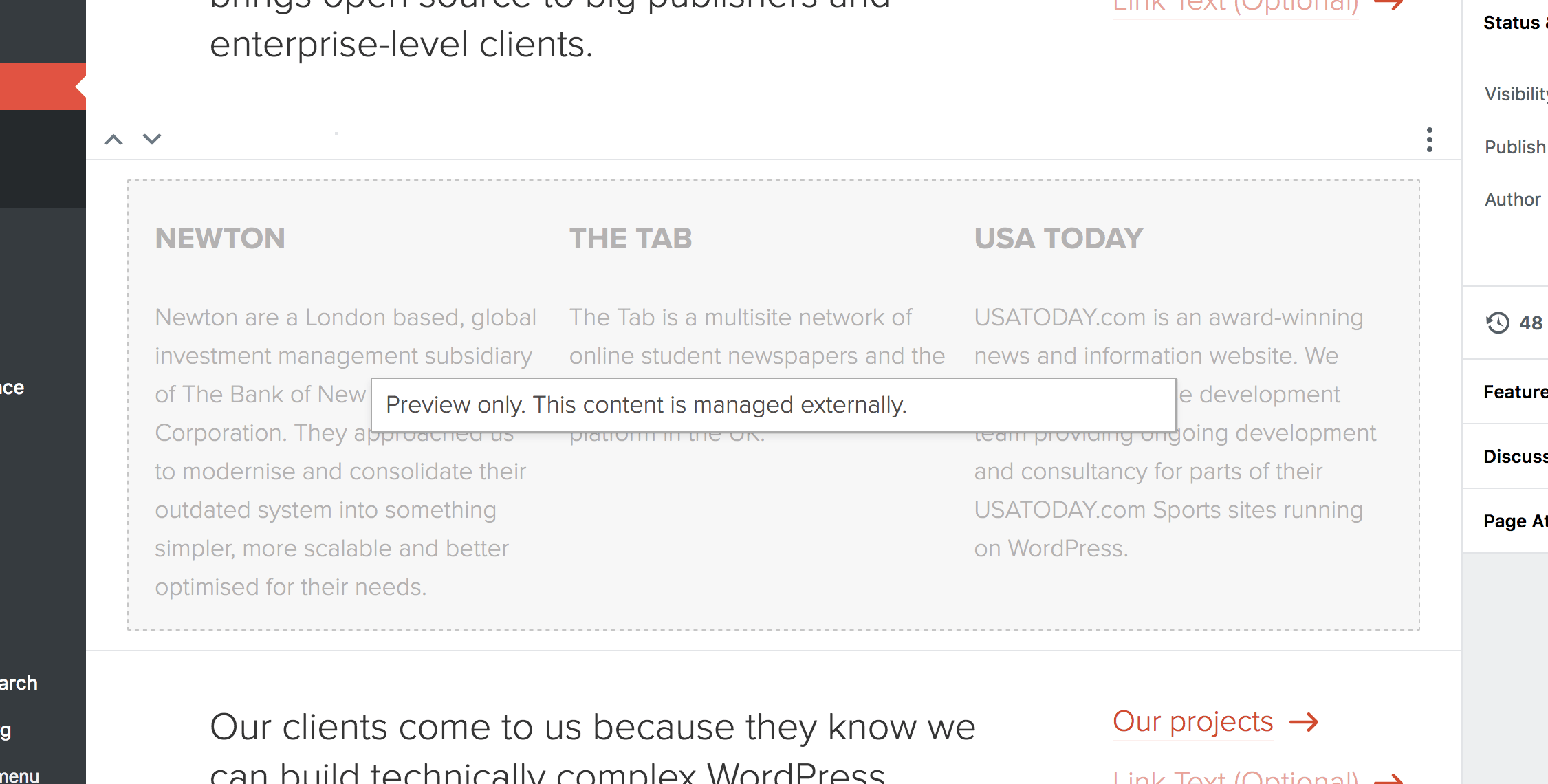
We have a featured projects block that lets the user select a project post, and it then displays the title/description. That content isn’t actually editable (instead you have to edit the project post type), yet I kept trying to select it.
I’d like to make it more obvious that certain content isn’t editable and I experimented with a design pattern to do so.

I’m interested to know what others think of this. Is it an issue, and what ideas do others have. I’m no UX designer. I’m sure that as the project matures, design patterns for building custom blocks will become more established. But right now, you have to answer a lot of these questions yourself.
Building blocks can be time consuming
I’m really excited by the potential of Gutenberg as a toolkit for crafting custom interfaces. Already, there are a lot of reusable components included that make this pretty easy, and keep things consistent. I have no doubt more components will be provided by the community.
Despite this, the process can be time consuming, and requires certain technical and design skills to ensure it looks good, and works well. The page builders and custom meta box frameworks that exist today allow developers to build things really quickly and easily as you just register a few form fields.
Many developers won’t have the time to build custom block interfaces for client projects. However, I’m sure that tools will spring up that allow you to simply register a block interface. Than has been working on adding Shortcake support to Gutenberg, and gives some insight into what will be possible.
Human Made Gutenberg Tools

I created a few reusable tools that others might find useful. For now I threw them together in a Github repository. Consider it very much a beta version, but if it’s useful maybe it can become something more polished.
Editable HTML field. The multiline editable component is tricky to work with, and doesn’t like it if you store your data as an HTML string. This component is a wrapper that handles converting strings into a format that the component can handle.
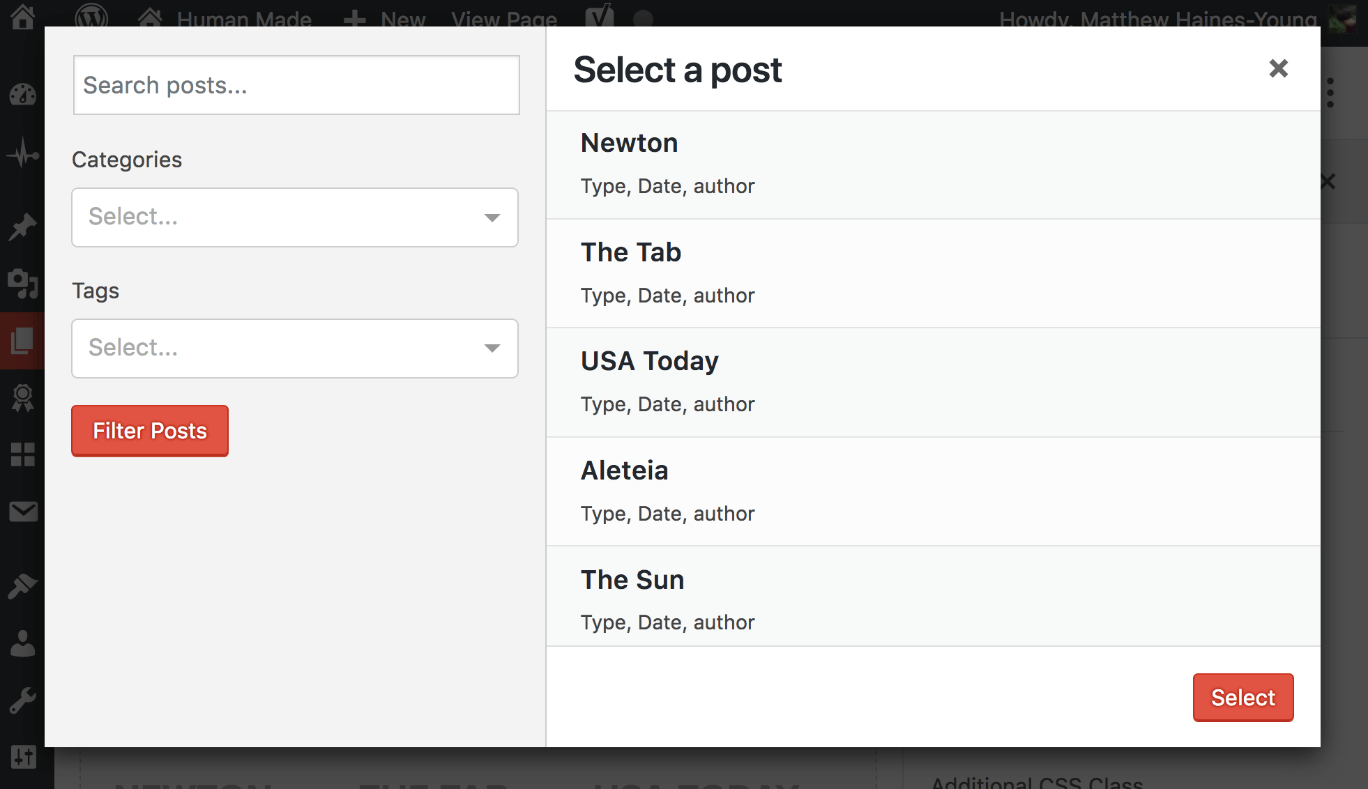
Post select UI. The post select field in the HM custom meta box plugin has been a key part of many site builds. I had a go at re-imagining this for the future, and built a media-modal-like experience for picking posts.
Conclusions
I think I dove in pretty deeply. I certainly spent more than just the 2 days I had originally planned! Overall, I’m a big fan. I’ve always been passionate about building great editorial tools and I’m really excited to see what people can achieve with Gutenberg in the future.
I think it looks great, and I think the concept of blocks is the perfect compromise between the flexibility clients need and the restrictions necessary to ensure a site is usable and looks great.
That said, there will certainly be a tough transition period. There will be compatibility issues on older sites. It will cost money (time) to upgrade. Clients will have to learn a new tool, and developers will have to learn new languages/frameworks. It’s a big change for everyone, and I am concerned that there is a lot of pressure to just ship this thing already. Gutenberg is huge and moving quickly. The wider community is struggling to prepare.
As developers, we really need to start building projects with this now. But this is tough to do when Gutenberg is still not feature complete. Clients will quickly run into things that aren’t supported and developers could struggle with a lack of tools and information. But I think the balance has finally shifted and for most new projects it’s worth the extra effort of using Gutenberg now .
Discover more about Project Gutenberg
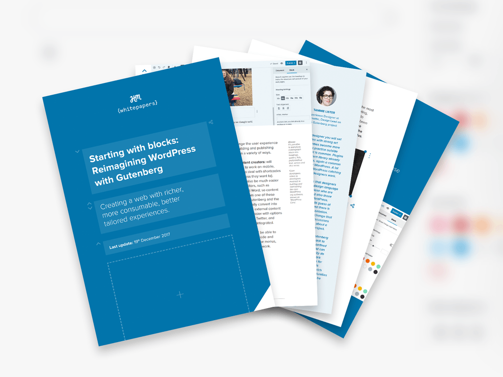
We’ve written a white paper for agencies and enterprise on a new future with Gutenberg. With contributions from a range of experts in the community, this paper gives in-depth detail on how and what businesses should prepare for.

