

There are many different ways to use the web besides a mouse and a screen. Users navigate for example with a keyboard only or with their voice. For all the different ways to understand and to interact with a website, it is necessary that the content, design and code is properly set up.
In this post, I will go through the ways to use the web, which guidelines we use, when to test, what to look out for when checking for accessibility errors, and which checks and tools you should use to help you with testing.
What are the specs?
The World Wide Web Consortium (W3C) developed guidelines to safeguard the accessibility of a website: the Web Content Accessibility Guidelines: WCAG.
We are currently at version 2.2, published in October 2023. WCAG 2.2 adds new requirements such as focus appearance, visible controls, and drag-and-drop alternatives. Work is also ongoing on WCAG 3.0, which is still in draft.
There are 3 levels:
- A, basic accessibility
- AA, the worldwide standard also used for government, public service websites and WordPress core
- AAA, for dedicated software
We test for the WCAG 2.2 AA guidelines.
Accessibility team handbook
The WordPress Accessibility Team Handbook contains best practices on how to meet those guidelines. There are chapters about content, design and frontend, and it is updated regularly.
With sponsorship from Human Made, I’m currently working on a project to create a comprehensive Accessibility Knowledge Base for WordPress. The intention is that the Hub will become the single source of truth for WordPress accessibility. It will:
- Consolidate guidelines, tutorials, and testing tools in one central location
- Cover accessibility for both WordPress users and those who design, develop, and build with WordPress
- Be free, open, and community-driven
- Stay up to date with evolving standards, tools, and platform changes
Stay tuned for progress updates!
Checklist on WebAIM
WebAIM is a great resource of information for web accessibility. On their site, you can find an accessibility checklist. The site contains a wealth of information on all the subjects concerning what is important and what are best practices.
When to test?
There are 5 critical points in the test workflow.
Brand guidelines:
If you build a website for a company they may have brand guidelines, check them first. See what you can use for the website design and what needs to be adjusted (the colours, the fonts).
3rd party plugins:
Test functionality you want to add to your project first before implementing it. If a plugin isn’t accessible, maybe you have to build the functionality in-house or help the developer improve the plugin.
Web design:
Keep the accessibility rules in mind while designing and test the end result before you hand it over to the developer.
Development:
While developing, test each component before you continue with the next one. Don’t test at the end of your work, you may have to redo a lot.
Content:
Test the content before launch but keep testing the production site on a regular basis.
Don’t test accessibility at the end of the project. This could mean you have to do a lot of work, like design and development, all over again. This will ultimately cost more time and money than adjusting things during the project.
Design
Colour contrast
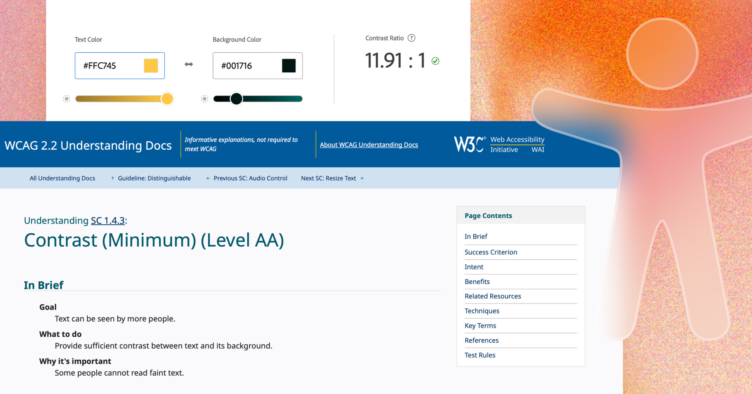
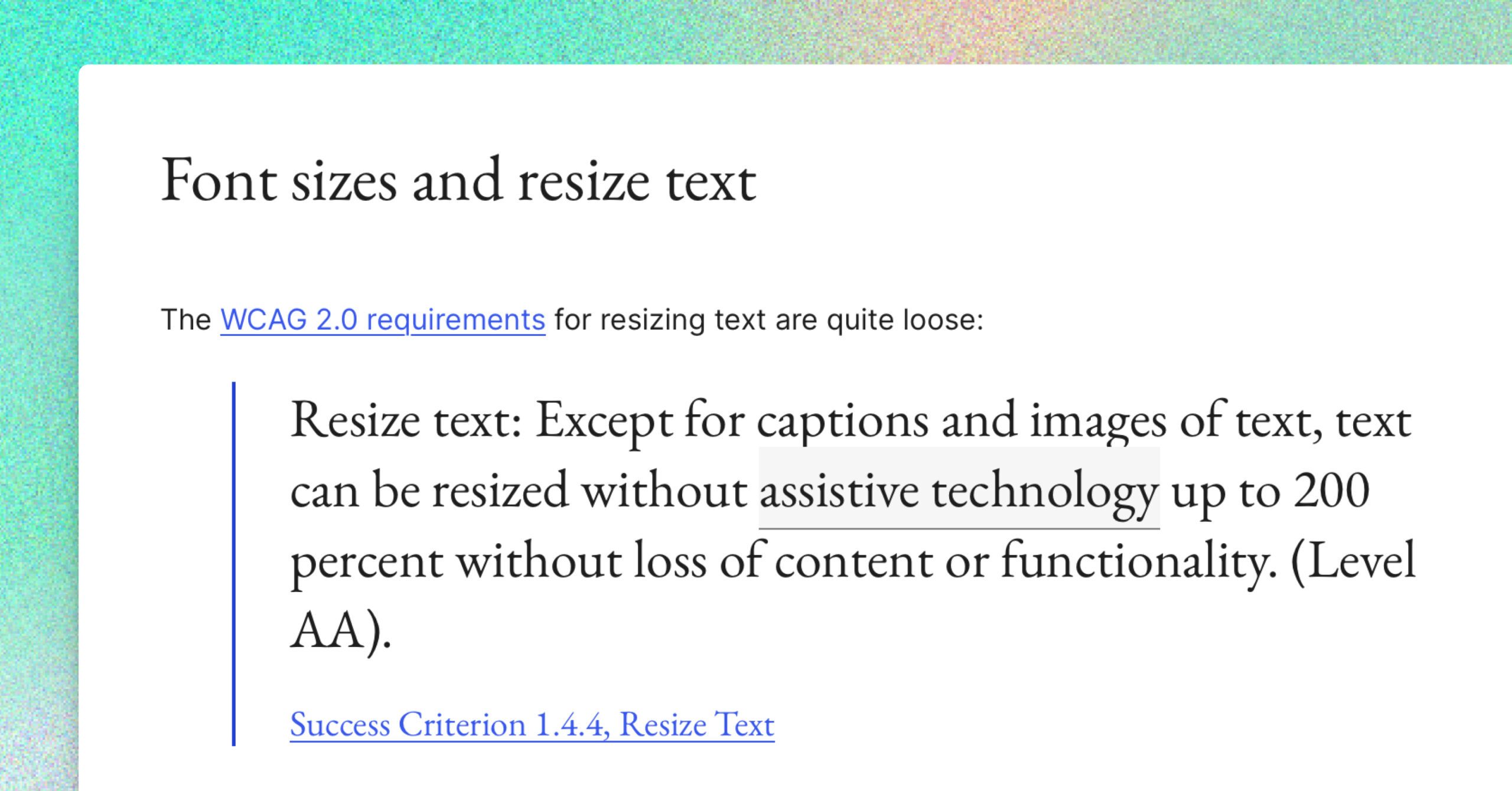
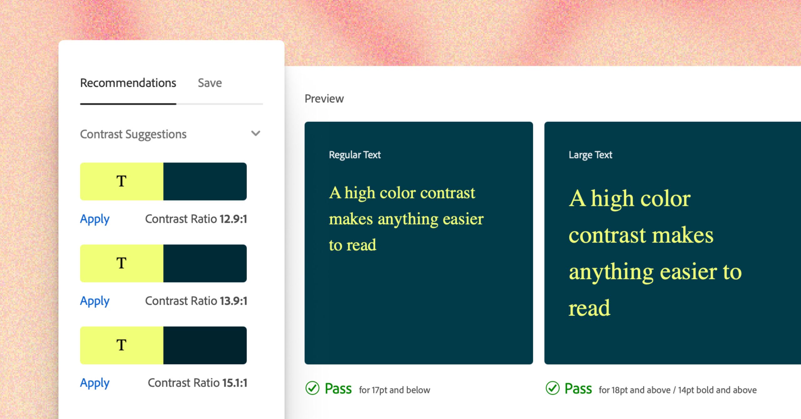
The visitor must be able to read the content. There is a WCAG guideline for colour contrast between text and background:
- Colour contrast ratio between text and background must be 4.5 or more for normal text and 3.1 or more for text of at least 24 pixels or 19 pixels bold
- For icons and graphical objects, WCAG 2.2 requires a contrast ratio of at least 3.1
Thankfully you don’t have to calculate this yourself. There are many tools you can use to test colours.
Colour contrast check tools:
- Figma Color Contrast Checker
- Contrast Checker
- ColorA11y (Chrome Extension)
- WebAIM Contrast Checker
- Accessible color palette builder
- More contrast checkers on WebAxe
Note: Text in a (company) logo doesn’t have to comply with colour contrast rules.
Not by colour alone
Don’t give meaning to colour. Like indicating a link or an error message or an active menu item, only by change of colour. This is especially important for people with colour blindness (8% of all men).
A great test is looking at your design in grey scale. Can you still understand the content and the navigation?
Colour blindness check tools:
- Sim Daltonism tool for colour blindness check, for OS
- Coblis – Color Blindness Simulator
- More tools on colour contrast
The order of things
Keep the order of the elements logical – people (especially screen reader users) tend to read from the top down. If the order is different from what they expect, people may not be able to find what they need.
For example, in a form, don’t put required checkboxes below a submit button.
Gestalt design
Keep together what belongs together (proximity of controls).
Not everyone has a full overview of a web page, like people with Glaucoma. Don’t make them search for a submit button that’s on the bottom right, while the input fields are on the top left, for example.
Keep the action and the reaction close together. Try looking at your website through a drinking straw – this will help you to understand the screen scanning some visitors may have to do to navigate and use your site.
Development
Always include 3 checks during development and make them part of your development routine.
- Keyboard testing
Can you access all content and perform all tasks using a keyboard only? Spend one morning figuring out how that works. The keyboard testing guide on WebAim has good information. - HTML Validation
Is the generated HTML of your site error free? Check your frontend code with a tool like the W3C validation online validator. Get the errors out, read the warnings and decide if the warnings apply to your work. - Accessibility testing
There are several tools you can use to test for WCAG 2.2 AA.
- axe DevTools browser extension for Chrome, Edge and Firefox
- axe-core, an NPM module for integration and unit testing
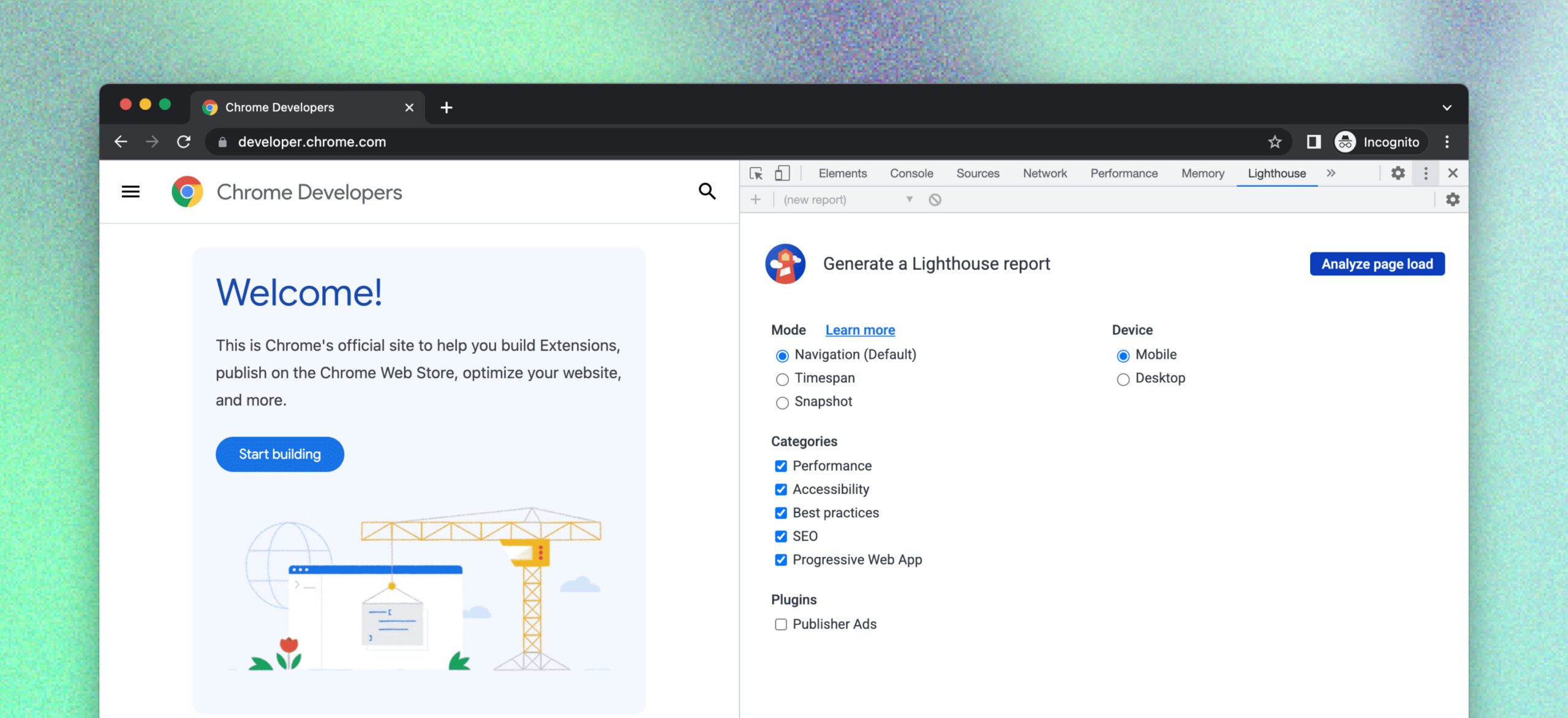
- Lighthouse built into Chrome DevTools
Note: validators are not perfect; manual testing is still necessary. They can miss issues, and sometimes can also give false positives. Investigate if the issues are valid – sometimes there’s no substitute for human intervention!
You can find more tools for frontend testing in the WordPress Accessibility Handbook.
Dynamic content
Content that changes dynamically without a page reload, like JavaScript generated error messages or React created content, must also be announced for screen readers. The best way is to test this with a screen reader like Apple VoiceOver (for Mac and iOS), NVDA (for Windows), JAWS (Windows), or TalkBack (Android).
Listen to your website.
- VoiceOver cheat sheet by Paul J. Adam
- VoiceOver Getting Started
- NVDA
- NVDA shortcuts
- JAWS
- TalkBack
Automated testing
Accessibility testing is always frontend testing, as there must be a generated instance of a browser against which to test the code. However, automated testing currently does not capture all the errors. Testing keyboard accessibility and announcing of dynamic changes by a screen reader still need to be manually tested.
As a productive workflow, I suggest keeping the focus on frontend a11y testing with keyboard and the axe browser extension during development. Add checking with keyboard and axe in the browser as a requirement for new or updated functionality in a project (for example when committing a pull request to GitHub).
To investigate for future use:
Web content
Be sure you check the following issues:
- Readability
- Aim for plain language and a reading level of around 12 years old.
- Headings
- Headings are the framework for the content
- One h1 per page, describing the content of the page
- Divide the rest of the headings meaningfully
- Do not skip a heading level
- Use a meaningful link text
- Avoid “click here”, “read more”, ”download”, “continue reading”
- If you use an image as link, use the alternative text as link text
- Video and audio
- Add subtitles and closed captions for video and a transcription for audio
- Must be operable by keyboard only
- Don’t autoplay audio or video with audio
- Images
- Check if an image has a proper alternative text
- If an image is purely decorative: add it to the CSS of your theme or leave alt attribute empty
- If an image has meaning: give a short describing alternative text
- If the image is a chart or an infographic, add an alternative in text
Alternative text, subtitles and transcriptions are content Google can also read, so this is valuable content to add for SEO.
To wrap this up
Accessibility is not a courtesy to a few visitors, but an essential component of the quality of your website.
When you are young, you are invincible, indestructible. You own the world, you know stuff. When you get older, or are not so lucky, things break. Your ears, your eyes, the way you move, the way you think.
Hopefully we all grow very old. So you better make sure that your future is accessible!
Want to know where your website stands on accessibility? Check out Human Made’s Accessibility Audit services or get in touch.