

Accessible design helps deliver content to a wider audience. Even small improvements—like using semantic HTML, properly structured CSS, and accessible JavaScript—make websites more robust, easier to maintain, and better prepared for future technologies.
Everyone has a role to play in making the web accessible: developers, editors, theme builders, and content creators alike, but often it’s designers who hold the keys to unlocking full accessibility. Let’s dive in to a practical overview of accessibility principles and best practices to include in your design workflow.
Understanding accessibility guidelines: WCAG 2.2 AA
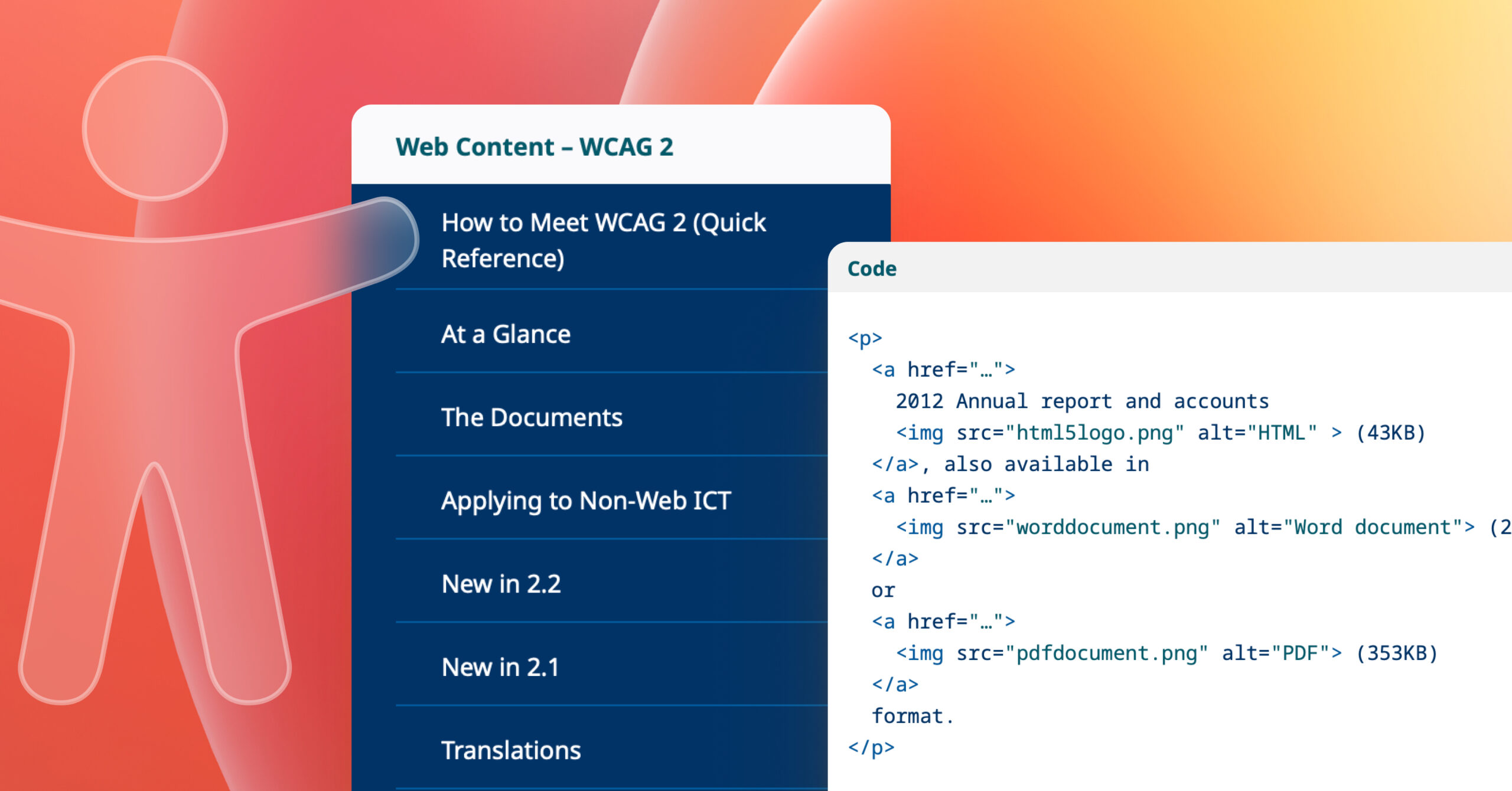
Web accessibility measures how easily people of all abilities can use and interact with a website. The Web Content Accessibility Guidelines (WCAG) define international standards across three levels: A, AA, and AAA. Today, most organisations use WCAG 2.2 Level AA as their baseline standard for creating accessible digital products.
Depending on your region and the nature of your website, such as whether it serves the public sector, specific accessibility requirements may be legally enforced. To confirm which standards apply to your business, consult reliable sources such as W3C’s Accessibility Laws by country, or the W3C Web Accessibility Initiative overview of WCAG 2.2.
Key takeaways
- WCAG 2.2 AA is the current global accessibility benchmark.
- Legal accessibility requirements vary by country and sector.
- Following WCAG ensures inclusivity and regulatory compliance.
Designing for accessibility
When designing for accessibility, focus on clarity, contrast, and consistency. Always ensure that text and background colours have enough contrast to be comfortably readable. Avoid ultra-thin typefaces that can make text difficult to distinguish. Avoid relying solely on colour to communicate meaning: use text, icons, or labels to reinforce visual cues.
Links within body text should be underlined or otherwise clearly distinguished so they’re immediately identifiable. Every page should include a clear, unique title using an <h1> heading, and input fields should have visible borders and corresponding labels to guide users. Navigation should be predictable and consistent, offering more than one way to find information, such as a main menu, a search field, and a sitemap.
All-caps text should be avoided, as it can reduce legibility and may interfere with screen reader pronunciation. Similarly, avoid animation or motion that users can’t pause, stop, or disable. Subtle motion can be effective, but only when it enhances rather than hinders the experience.
Key takeaways
- Prioritise sufficient colour contrast and clear text hierarchy.
- Don’t rely on colour alone to communicate meaning.
- Ensure links, labels, and headings are visually clear.
- Offer multiple, consistent navigation options.
- Avoid all-caps text and uncontrollable animation.
Using accessible fonts
Typography plays a crucial role in accessible design. Always use real, selectable text rather than embedding text in graphics or images. Choose fonts that are simple and highly readable, and limit the number of different fonts you use across a site to maintain visual harmony. Body text should generally be set at a minimum of 16 pixels or larger, depending on the typeface, to ensure comfortable reading.
Don’t rely solely on visual styling such as colour, weight, or placement to convey meaning. For example, avoid using colour alone to indicate required fields in a form. According to WCAG 2.2, users must be able to increase line height, letter spacing, word spacing, and paragraph spacing without loss of functionality or content, so designs should allow for this flexibility. Aim for line height around 1.5 times the font size and generous paragraph spacing to improve readability.
Before committing to brand colours, verify that all text—headings, body copy, and text placed over images—has sufficient contrast against its background. Proper colour contrast benefits everyone, not just those with visual impairments.
Recommended Fonts
For body text, use web-safe or system-native fonts that render consistently across browsers and devices. Sans-serif fonts like Arial, Helvetica, or Verdana are generally easier to read online than serif or decorative typefaces such as Times New Roman. Decorative or condensed fonts can still play a role in your design, but should be reserved for headlines or display use where short bursts of text are presented.
Additional resources:
Typefaces and Fonts – WebAIM, Say no to faux bold – A List Apart, Line Length Readbility – Baymard
Key takeaways
- Use real, selectable text, not text in images.
- Stick with clean, legible fonts and minimal font variety.
- Keep body text at least 16px, with comfortable line spacing.
- Don’t rely on font style or colour alone for meaning.
- Check brand colours for adequate contrast before use.
Testing for colour contrast
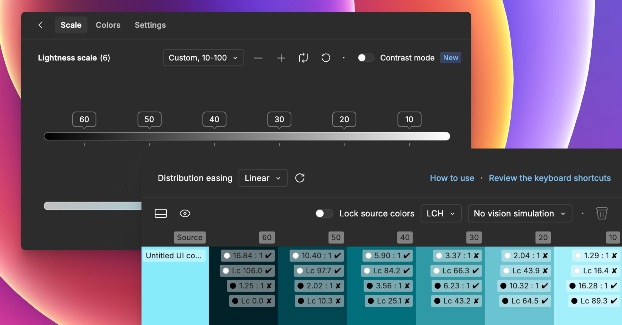
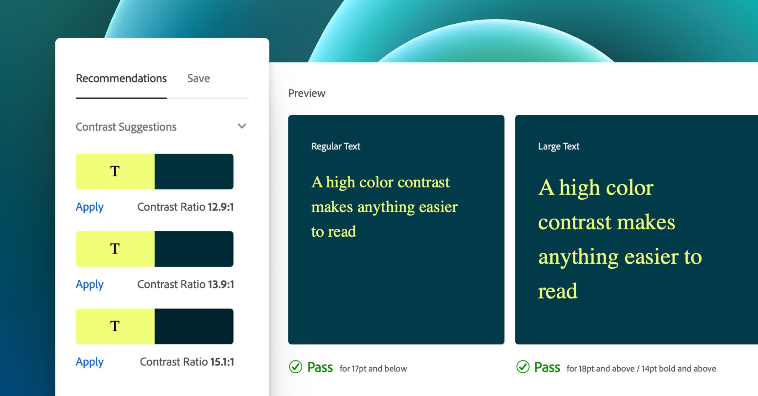
Accessibility testing should be an ongoing part of your workflow, from early design stages to final development. The contrast ratio between text and its background is a key factor in readability. For normal text, the contrast ratio should be 4.5:1 or higher, while large text (24 pixels regular or 19 pixels bold) should meet a minimum contrast of 3:1. WCAG 2.1 added the additional success criterion of non-text contrast, which requires UI controls and meaningful graphics, i.e. icons, form-field borders, etc., to have a minimum contrast ratio of 3:1. These ratios ensure text remains legible for users with low vision or colour blindness.
Note that these rules do not apply to text within logos or decorative brand marks, though maintaining good contrast there still improves overall visual impact.
Several free tools can help you evaluate colour contrast: WebAIM Contrast Checker is a simple and reliable web-based tool; Contrast Grid allows you to compare multiple colours at once; TPGi’s Color Contrast Analyzer works well for desktop testing; and plugins like Stark integrate directly into Figma, Sketch, and Adobe XD for in-app accessibility checking. For designers on macOS, Sim Daltonism simulates colour blindness to help you visualise how your designs appear to users with different types of colour vision.
Key takeaways
- Test accessibility throughout the entire design and build process.
- Maintain a minimum 4.5:1 contrast for normal text and 3:1 for large text and non-text content.
- Exclude logos from contrast rules, but keep them readable.
- Use reliable contrast-checking tools during design.
Additional resources to help you nail accessibility
If you want to explore accessible design in greater depth, there are many excellent resources that provide both inspiration and practical guidance. A great place to start is W3C’s Designing for Web Accessibility resources, while Inclusive Components and Heydon Pickering’s Inclusive Design Patterns offer in-depth looks at accessible UI patterns. The Inclusive Design Checklist provides a straightforward way to evaluate accessibility throughout your workflow. Microsoft’s Accessible design toolkit offers checklists on top accessibility/usability tenets and more.
For a broader overview, the article 7 Things Every Designer Needs to Know About Accessibility by Jesse Hausler remains a great introduction. For content creators, Sami Keijonen’s guide on Writing Accessible Content offers clear, actionable advice.
You may also find 6 Principles of Visual Accessibility Design by Jenna Erickson and Designing for Accessibility: Colour Contrast by Neil Shankar helpful for understanding visual design nuances. Vitaly Friedman’s Designing For Neurodiversity article provides solid practical guidance on inclusion and support for neurodiverse users. Finally, Accessibility for Everyone by Laura Kalbag, along with the resources from WebAIM and Penn State Accessibility, remain foundational reads for anyone committed to creating inclusive digital experiences.
Key takeaways
- Explore deeper design patterns from trusted accessibility experts.
- Use checklists to review accessibility throughout design.
- Stay updated with modern, maintained resources.
- Keep accessibility learning ongoing—it evolves with technology.
Conclusion
Accessible design isn’t a one-off checklist to complete; it’s an ongoing commitment to creating digital experiences that welcome everyone. As design standards evolve, so should our practices. Keep learning, testing, and iterating. Small, consistent improvements, like adjusting contrast, improving typography, or writing clearer content, can make a significant impact on how people experience the web. Let’s be part of the change we want to see.
Learn how your site’s accessibility could be improved with a WordPress Accessibility Audit from Human Made.