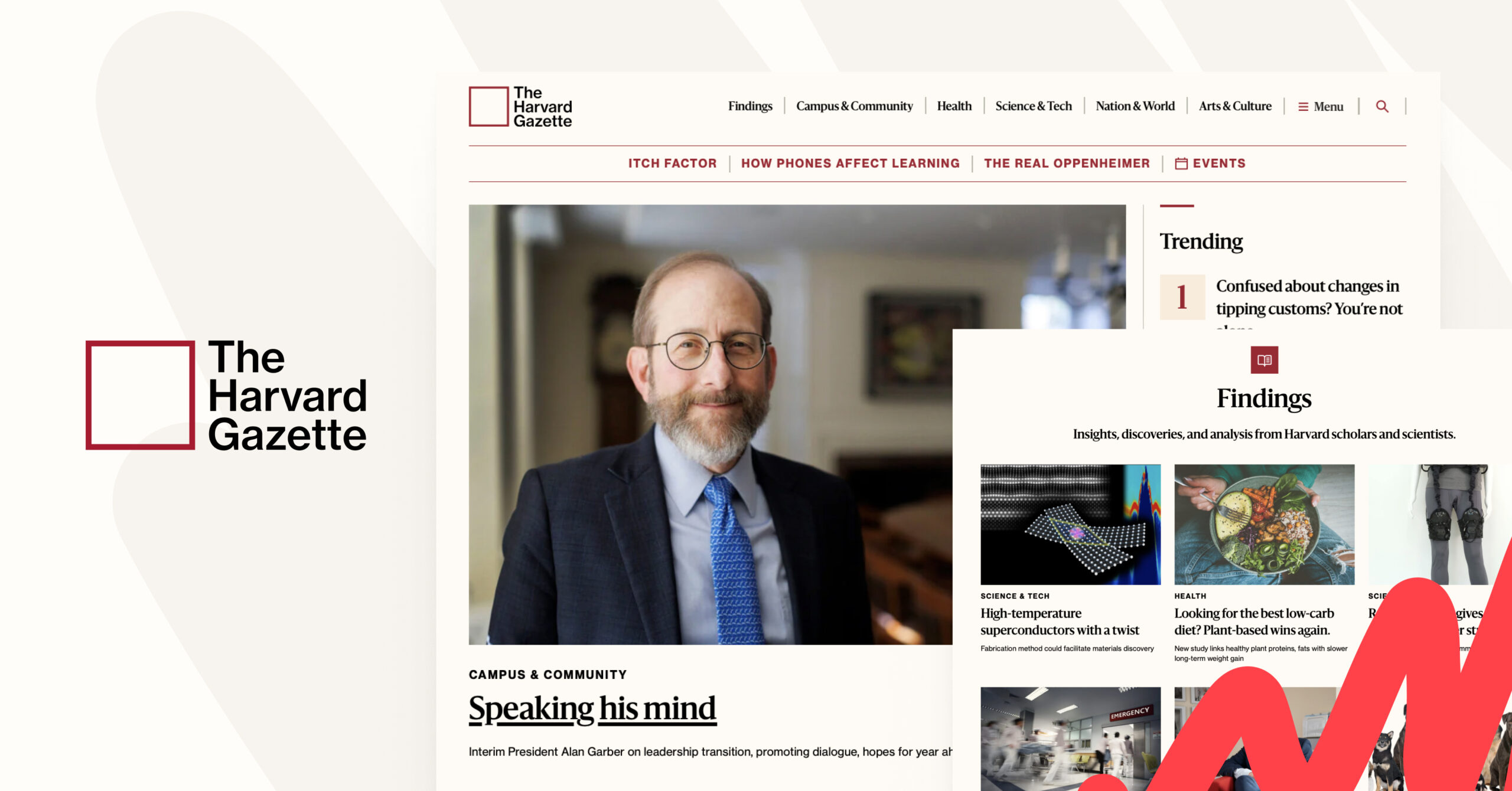
We recently partnered with Harvard Public Affairs and Communications to work on the relaunch of the Harvard Gazette website on WordPress. As well as being an absolute pleasure to work with the teams over at Harvard, we had a blast creating custom features and rising to the challenge of making the site totally accessible.
The Harvard Gazette is the official source of Harvard news, including everything from official University announcements, to Q&As with professors, scientific research, community information, updates on the beloved campus cat (Remy), and so much more. The Gazette sends a daily email to 300,000+ subscribers and also has a section called News+ where publishers from the various Harvard schools can elevate their stories to gain a wider audience.
As the official news source for one of the premier Ivy League schools, all eyes are on Harvard. So in addition to being beautiful and making content easy to discover, the site also needed to be accessible AND include some exciting new ways to tell stories.
Going all-in on FSE with the Harvard Gazette WordPress site
For context, we decided early on that we would be early adopters and went all-in on full site editing, using the Gutenberg plugin to get new features that hadn’t yet made it to WordPress core. Our goal was for every part of the Harvard Gazette WordPress site to be easy to edit by the internal team, and for the front end to be fully accessible to all users.
Our people who are actively building experiences or stories feel like the WordPress block editor is such a time saver and speeds up time to completion.”

Aaron Baker
Senior Associate Director, Content Strategy, Harvard Public Affairs & Communications
What we built
- Extended 5 of the core blocks
- 13 block patterns, including several media gallery layouts
- 6 archive template layouts (3 are unique, the others are variations)
- 33 custom blocks (some are adapted from other projects)
You might be thinking “why so many custom blocks?”, and you’d be right to! In reality, of our 33 custom blocks, 14 are child/parent pairs and ~7 are what I’d call “wrapper blocks” or “bundled blocks”. This is when we define a block pattern to use as inner blocks for a custom block wrapper, or sometimes create an empty pattern that accepts any block, like a group block with a specialised purpose.
Find out how higher education institutions can get more from WordPress.
It allows us to take advantage of existing functionality, and also add block styles and settings saved as block attributes. We can even add custom content around an editable inner blocks section. This gives us control over layout, gives content editors the customisation controls they’re used to from the core blocks, and allows us to build cool features much more quickly.
That said, there were many needs we simply couldn’t meet with core blocks. Either it was so complex and bespoke, we didn’t think we’d find a plugin to do the job, or so simple that we’d spend longer searching for one and reviewing it than just writing our own.
We loved working with the Harvard team, and while it’s tricky to choose just three things we love about this site, we’ve narrowed it down to the absolute best bits! Let’s dive in.
Colour palette picker
Many of the blocks required the ability to select the text colour and background colour, with a pre-defined palette. We decided that it would be easier for the editors to add colour palette selection, instead of choosing the colours separately. This would also help to ensure accessible colour combinations by default.
As an example, the stats block has 3 different block styles (transparent, sand, or coloured):
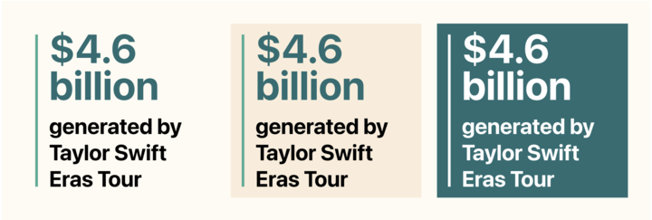
The coloured elements within the block can be red, green, blue, purple, yellow, or grey. Depending on whether they are text or decorative, the elements will be different specific shades of the colour (chosen for accessible colour contrast), but they should all be the same colour. We needed a way to set all of the colours at once, so we added a settings panel for a colour palette picker to the block:
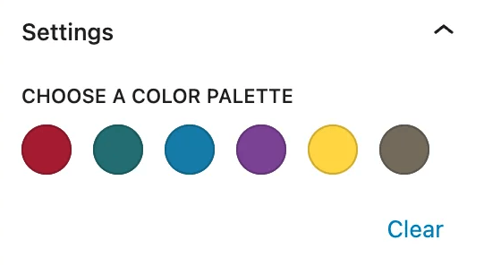
When a colour is selected, CSS custom properties are added to the block inline styles to define what all of the colour values should be. Then in our stylesheets we only have to set those variables once, instead of defining values for each colour combination.
The default values for the CSS custom properties are set in our theme stylesheet to the crimson colours, and we also use the colour palette picker at a page/post level to allow colour selection for all coloured elements within a post. This adds the values as an inline style block to the html head. So the priority order for colours is:
- Block level override
- Page level override
- Default (crimson)
Article header block
An article header block with 6 block styles that includes the colour palette picker mentioned above; each block style also has some display options, like flipping which side the image is on, the title position, fading in the text on load, and creating a parallax effect by fixing the background position.
The 6 block styles are:
- Classic
- Display title
- Full-width text below, which also has a centered image version
- Fullscreen
- Split screen
- Square
Featured articles block
A featured articles block with 11 different block styles that supports post selection from multiple post types and taxonomies. This block also allows editors to override the titles and thumbnail images for posts that are manually selected.
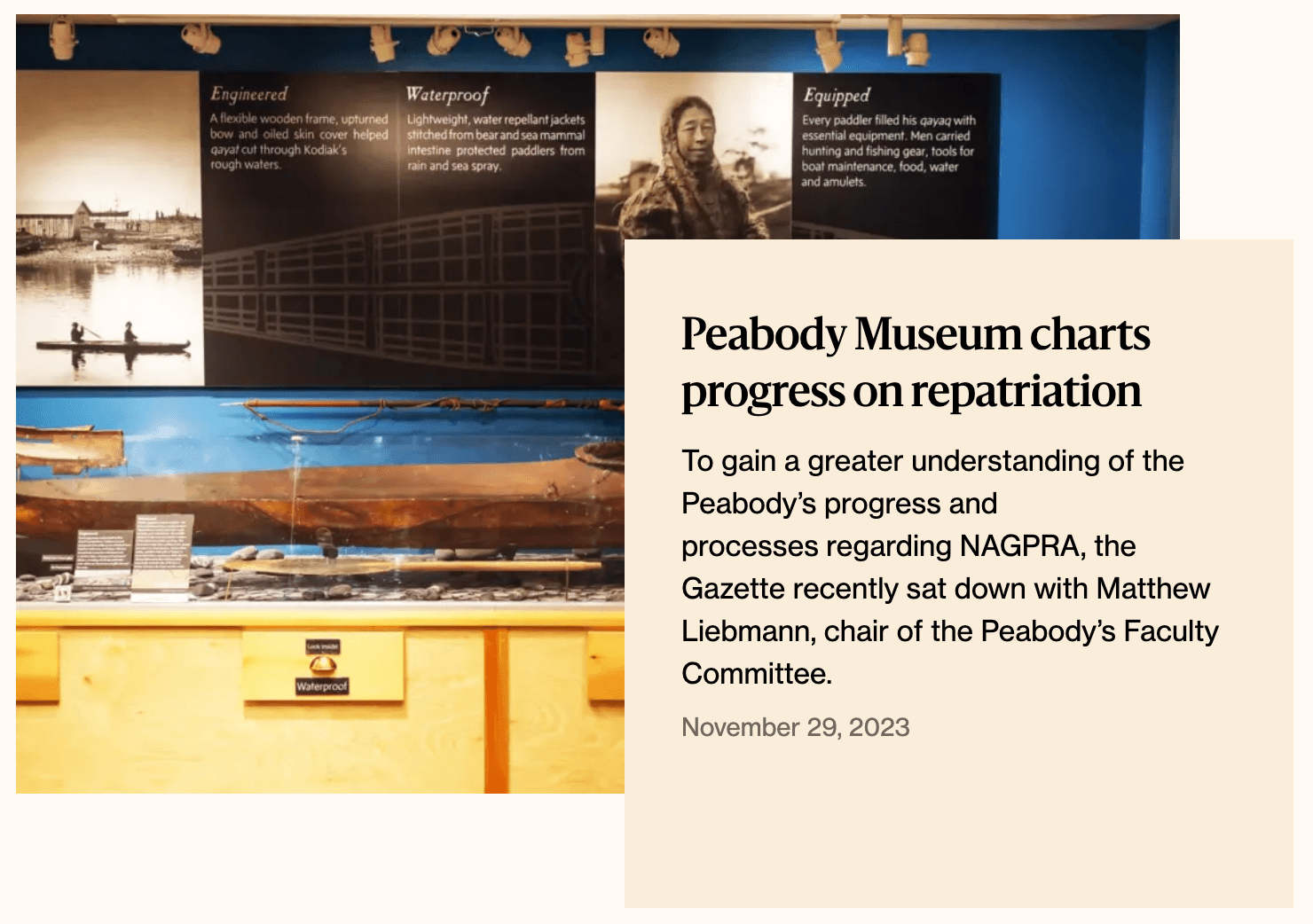
Most of the sections on the homepage are examples of this block. Between the 11 block styles and various other block settings, the look can vary widely from a simple list of titles to various grid layouts, a single post with a drop shadow, or what we call the “stacked promo”, which looks like this:
But don’t just take our word for it – we chatted to Aaron Baker, Senior Associate Director, Content Strategy at Harvard Public Affairs and Communications at our recent WordPress for Enterprise event to get his personal take on the Gazette team’s new WordPress site. Check it out 👇
