Case study
TechCrunch: rebuilding digital experiences for speed & agility
Empowering editorial experiences for faster, more efficient workflows.
Industry
Technology
Services
Development, Consultancy
Humans
About TechCrunch
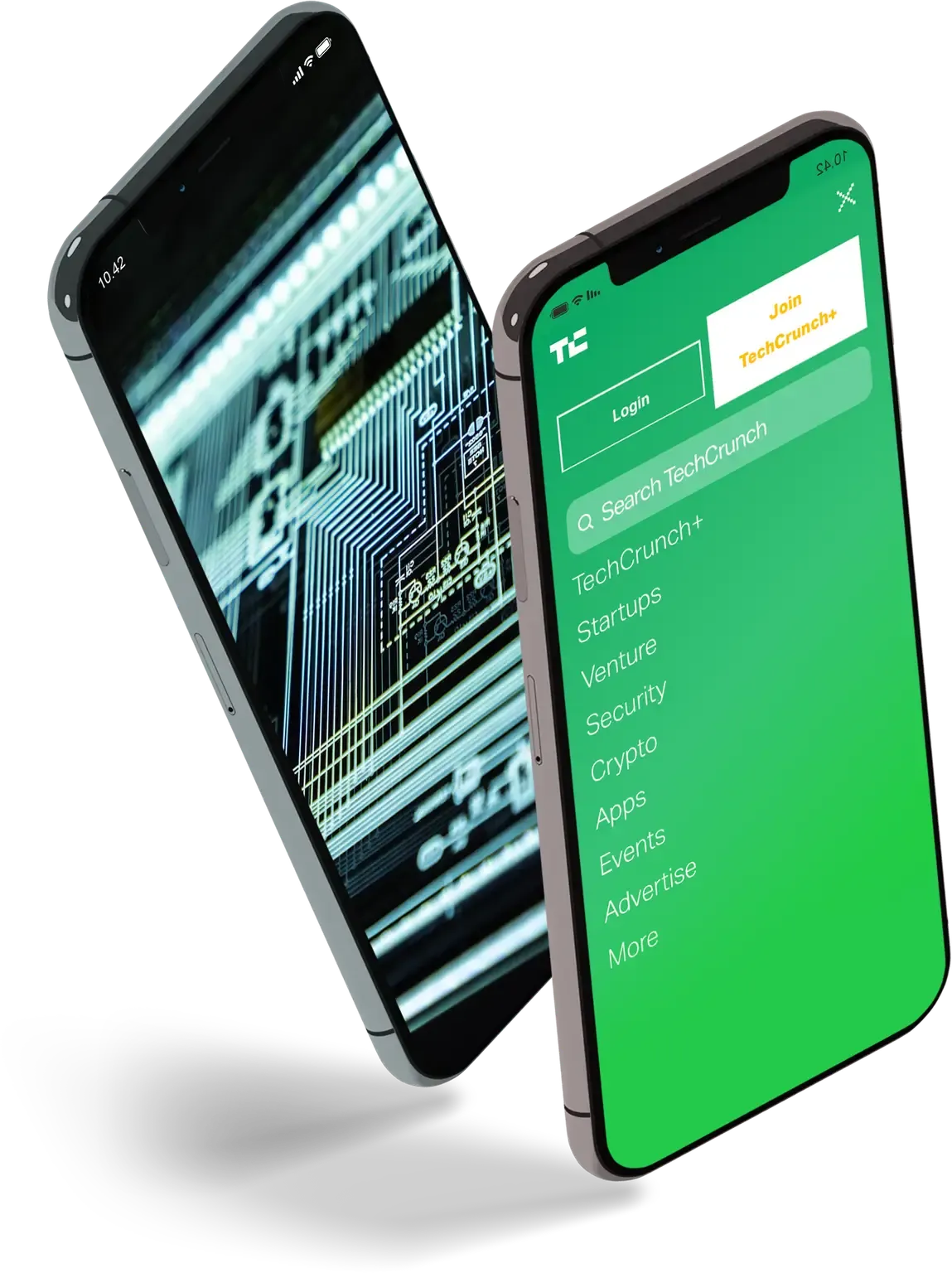
Founded in 2005, TechCrunch is the leader in online publishing in the tech and startup space. They are one of the most renowned publications in the technology and startup industry with an unparalleled insight into the nuances of Silicon Valley and its impact on the wider technology ecosystem. They are leaders in breaking technology news, averaging approximately 40 million monthly visits and amassing huge influence through their renowned TechCrunch Disrupt events.
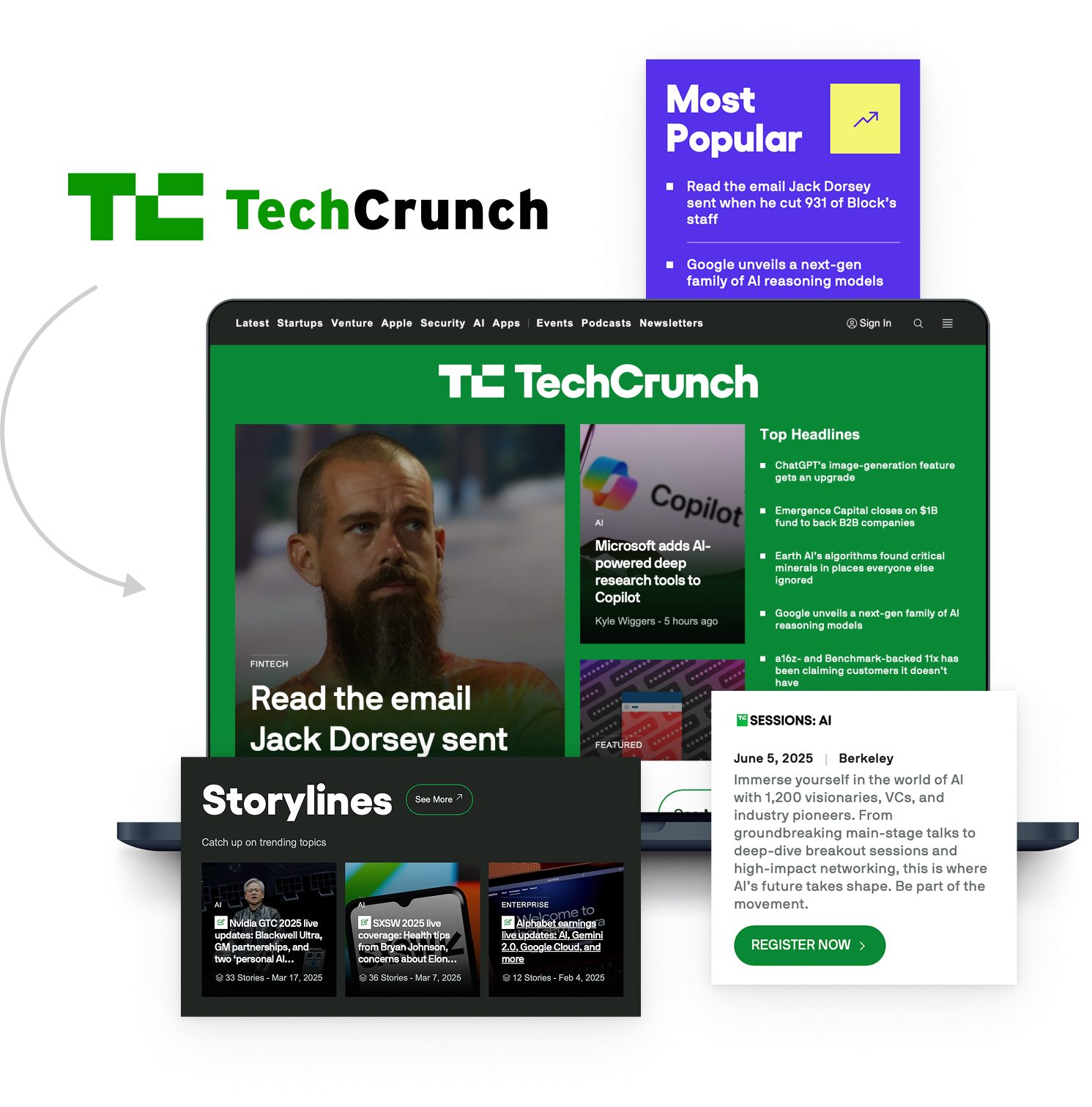
TechCrunch approached Human Made to collaborate on a redesign project and help them achieve their goals of a better performing, more streamlined CMS. Already familiar with the advantages of WordPress, Head of Product, Nicole Wilke, chose to accomplish this by capitalising on advancements with the WordPress REST API to build out a headless architecture on managed WordPress hosting.
Decentralised publishing: empowering editorial
As leaders in the technology publishing industry, TechCrunch wanted to find a modern solution that would empower their editorial team, and give them more freedom and flexibility in their daily workflows. To achieve this, one of our primary aims was to create a simplified editorial experience for non-technical teams, resulting in a publishing platform that could be used and enjoyed by TechCrunch’s publishers. To build that successfully we created a decentralised publishing model, that both supports the editorial team and gives users the best possible online experience.
The decentralised publishing model implements a headless WordPress CMS and a React frontend, giving TechCrunch the ability to quickly evolve their design to meet new business needs, and keeping them at the forefront of publishing. This is made possible because the frontend is not embedded as part of the CMS. An additional advantage to separating the frontend from the CMS is that editorial teams can become confident using one tool — in this case, WordPress — regardless of the changes that might occur with subsequent redesigns of the frontend. This not only enables editorial to feel empowered using their platform; it also prevents the necessary delays with onboarding people to a new system every time a change occurs.
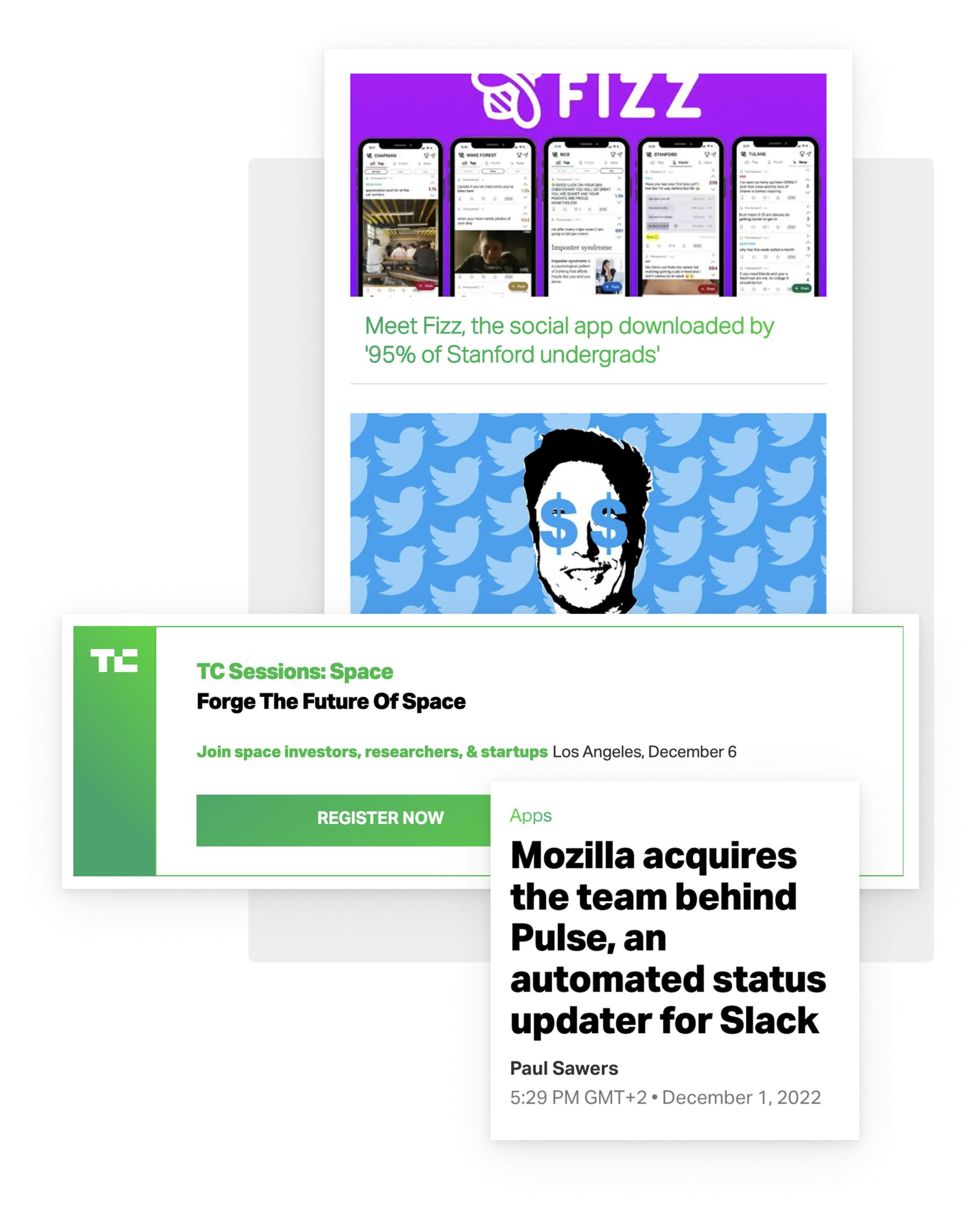
A new framework for user engagement and experience
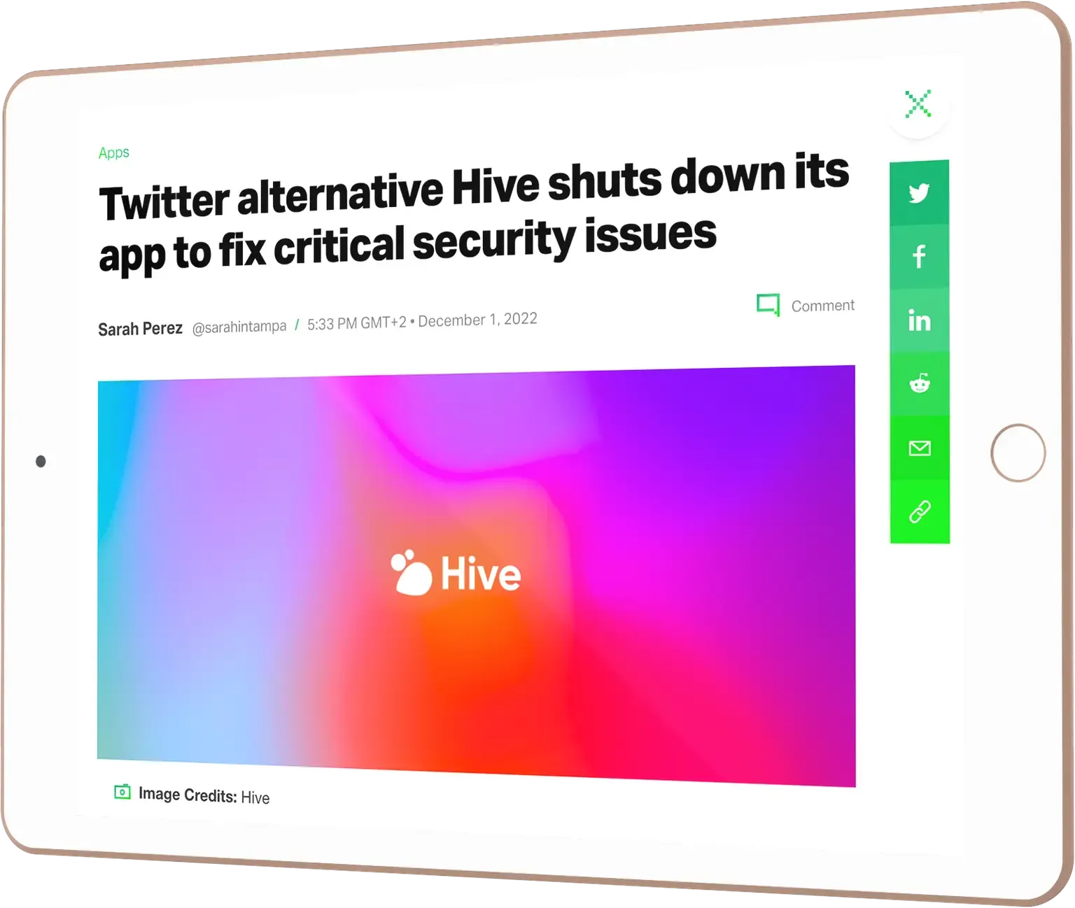
Creating accessible and readable stories, improving visibility and engagement, and transforming digital storytelling across video and text. Establishing a decentralised publishing infrastructure gave way to a whole new framework to improve user engagement and experience on TechCrunch. Right from the beginning, the team at TechCrunch approached us with a specification for each feature, and together we built out tailored solutions.
For TechCrunch’s website to best accommodate its users we needed to find a solution that allowed them to smoothly switch between articles on the homepage without losing their place on the site. We were also eager to simplify the user experience for their popular events pages, enabling users to easily find information on various events. We approached this with a focus on transforming storytelling across video and text, and making stories more accessible and readable to their audiences.odology, enabling flexibility and collaboration throughout development.
Increasing reader engagement: creating the Homepage River Experience
One of the most visited tech news outlets, TechCrunch publishes over 1,000 articles monthly. To improve the visibility of articles over time, TechCrunch proposed a homepage reading experience that would allow readers to immerse themselves in a ‘river’ of content.
This is achieved in a series of steps:
- A reader opens an article on the homepage
- Once selected, the article expands inside the ‘river’ of content on the homepage
- A progress indicator provides a way-finding tool to demonstrate their progress on the article
- Once a reader scrolls to the end of the article, the article snaps shut
- Once closed, the reader instantly returns to the homepage river of content
This feature presented a technical challenge around how users could access an article shared on social media, and how TechCrunch tracked the data on each article using their analytics tools. To better track user behaviour and serve ads, we needed to track single article views. TechCrunch did not have a single article view, so we needed to make accommodations for ensuring data was available regardless of whether the reader had discovered an article on the homepage, or from an outside source. As advertising is fundamental to TechCrunch’s business model, this was a critical feature in the project.
The homepage river feature not only enabled TechCrunch to bring visibility to more articles over a longer space of time, it also encourages better engagement on homepage articles as well as offering a more sophisticated experience for the reader moving between articles.

We wanted our redesign to be ambitious, and it was critical for us to choose a development partner who could deliver it without compromising on our aspirations.
Our developers had their hands in the project the whole time, which meant not only were we able to leverage our own internal resources to help get the project done, but that our developers were able to learn from Human Made’s deep domain expertise along the way, making them well prepared to take the final product and run with it after we launched.”

Nicole Wilke, Head of Product, TechCrunch
Download the full TechCrunch case study 📥
Get behind the scenes and see how Human Made and TechCrunch teamed up to build a state-of-the-art headless platform.
This form may not be visible due to adblockers, or JavaScript not being enabled.
Latest and Greatest
See our work
Learn the latest and greatest in WordPress site building. We’re offering tutorials, tips and tricks, and video walkthroughs on our blog.
Tell us about your project 💭
Whether you’re looking for website development, digital consultancy, a WordPress audit, or something else, our global teams are here to provide expert support tailored to your business goals.
Share the details of your upcoming priorities and we’ll work with you to create the best solution.
This form may not be visible due to adblockers, or JavaScript not being enabled.
