


Design systems have become one of the most powerful ways to deliver accessible digital experiences at scale. By embedding accessibility best practices directly into reusable components and patterns, they democratise inclusive design, helping teams build compliant, user-friendly interfaces without requiring every developer to be an accessibility specialist.
For enterprise WordPress implementations, design systems do more than improve efficiency. They act as a single source of truth for accessibility standards, ensuring Web Content Accessibility Guidelines (WCAG) compliance across multiple sites and brands while accelerating delivery and reducing long-term maintenance costs.
Why Design Systems Matter for Accessibility
Consistency: Design systems solve accessibility challenges once, thoroughly and correctly, and then distribute those solutions across every use case. This eliminates the risk of inconsistency or regression as projects grow.
Scalability: When accessibility is built into reusable, tested components, compliance naturally scales. Teams can launch new products and sites confident that accessibility is already part of the foundation.
Efficiency: Accessible components consolidate years of accessibility research, testing, and refinement. Teams can focus on innovation rather than recreating solutions that already exist.
Integration: A robust design system weaves accessibility into every stage of design and development. Accessibility becomes part of the workflow rather than an afterthought at the end of a sprint.
10 Leading Accessible Design Systems
These design systems demonstrate accessibility leadership and provide valuable lessons for WordPress teams building enterprise-level, inclusive experiences.
1. GOV.UK Design System
Widely recognised as a benchmark for accessibility in the public sector, the GOV.UK Design System is grounded in extensive user research, including with disabled users. Each component includes detailed guidance on keyboard interaction, screen reader behaviour, and implementation, ensuring real-world usability.
2. IBM Carbon Design System
IBM Carbon offers comprehensive guidance for designers, developers, and content authors. Its documentation covers ARIA usage, colour contrast tools, and testing methodologies, embedding accessibility as a shared responsibility across disciplines.
3. Salesforce Lightning Design System
Created for complex enterprise applications, Lightning serves as a model for accessible, data-rich interfaces. Its design specifications include explicit accessibility annotations that set a high standard for transparency and clarity.
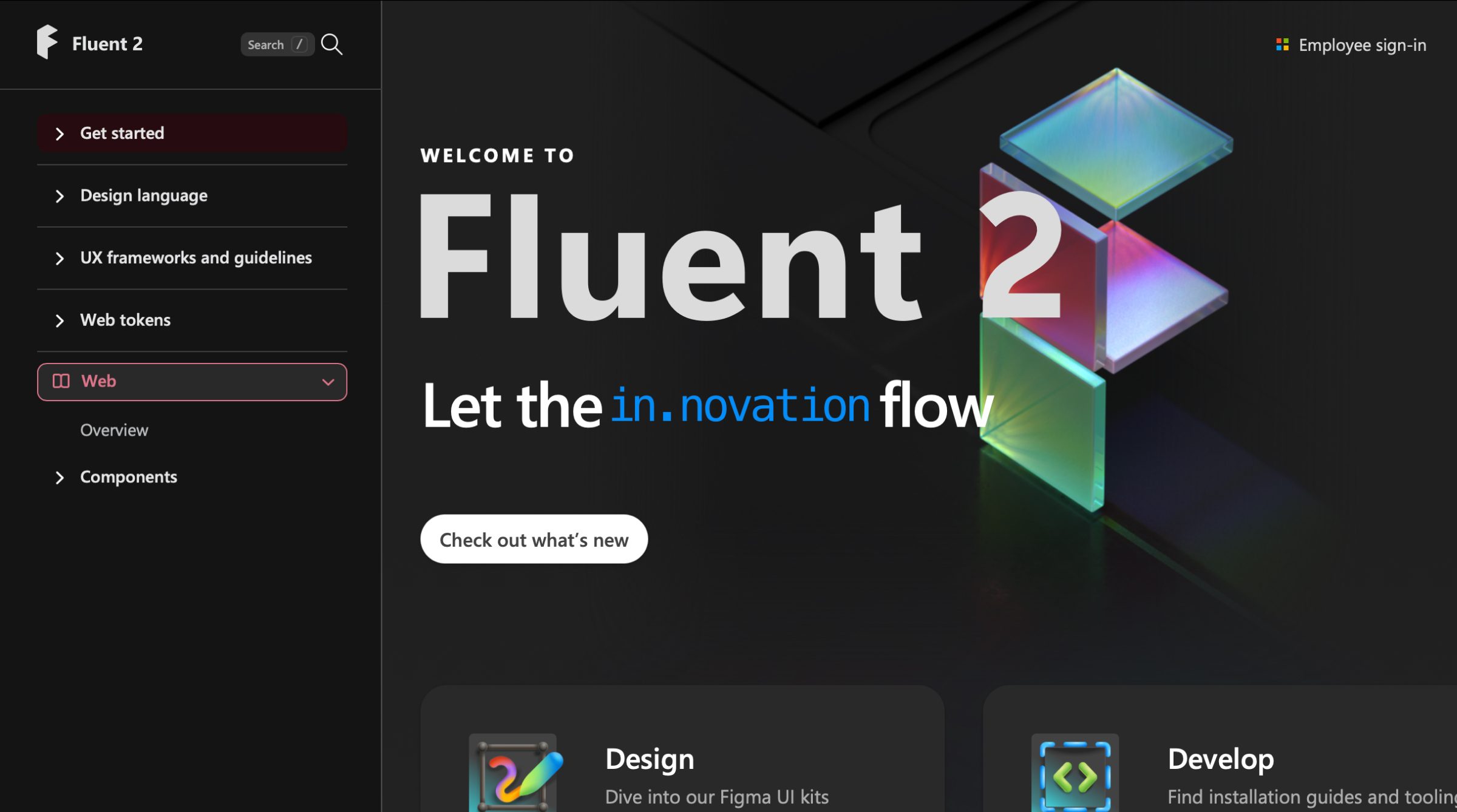
4. Microsoft Fluent Design System
Fluent prioritises adaptive, multimodal interfaces that account for motion sensitivity, touch interaction, and magnification. Its attention to sensory accessibility reflects an evolving, holistic understanding of user needs.
5. Material Design by Google
Material Design 3 introduced significant accessibility improvements such as enhanced focus indicators, larger touch targets, and improved contrast. Its guidance on motion and semantic colour use supports accessible visual design at scale.
6. Atlassian Design System
Atlassian’s documentation is practical and detailed, with examples of common pitfalls and clear “do and don’t” guidance. Its design tokens enforce consistent colour contrast and spacing, helping teams prevent regressions across products.
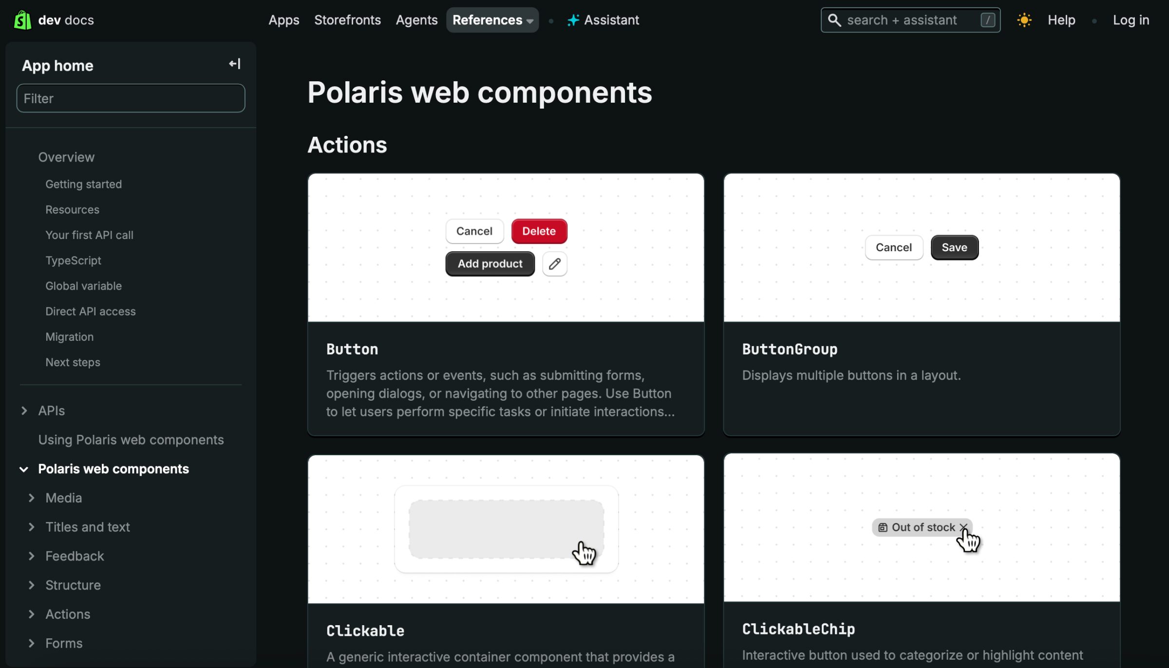
7. Polaris by Shopify
Polaris takes a merchant-first approach, focusing on accessible e-commerce patterns such as product galleries and checkout flows. It shows how accessibility can enhance conversion-critical user journeys.
8. Adobe Spectrum
Spectrum tackles the unique accessibility challenges of creative and complex interfaces. Its detailed approach to focus management and colour contrast supports usability in sophisticated tools such as editors and dashboards.
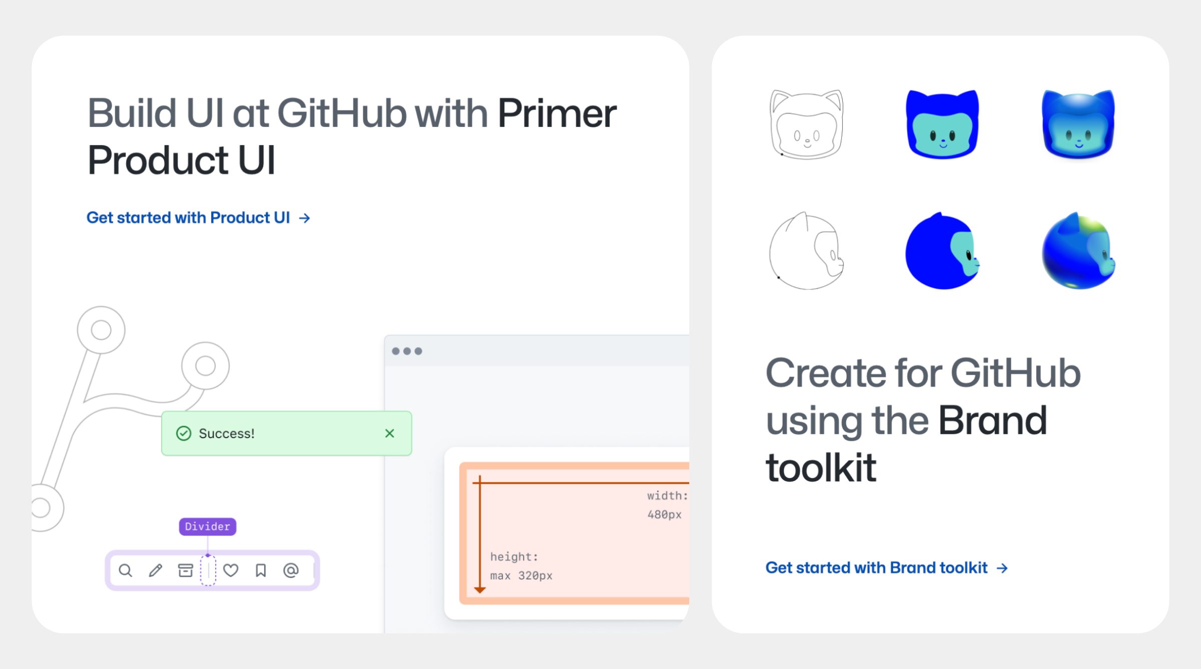
9. GitHub Primer
Primer is deeply developer-focused and built on strong semantic foundations. It emphasises progressive enhancement, assistive technology documentation, and automated accessibility testing, helping maintain quality in open-source environments.
10. BBC GEL (Global Experience Language)
The BBC’s GEL looks beyond visual accessibility to include internationalisation and multimedia inclusivity. It provides guidance on subtitles, audio descriptions, and sign language, making it a model of research-led, holistic accessibility.
How to Learn from These Accessible Design Systems
When exploring these systems, focus not only on what they include but also on how accessibility is embedded into their processes and decision-making.
Study these systems for:
Testing protocols
Strong accessibility practice goes beyond automated testing. GOV.UK tests with real users. Carbon mandates full keyboard testing for all states. Salesforce specifies the screen reader and browser combinations to be tested. Look for frameworks that prioritise human-centred testing and repeatable, documented validation.
Documentation methods
The best design systems make accessibility documentation easy to find and understand. Spectrum provides inline ARIA examples. Primer includes visual “do and don’t” patterns. GEL offers live screen reader demos. Good documentation clearly separates design, development, and content guidance to ensure clarity across teams.
Balance between flexibility and consistency
A mature system allows creative flexibility without compromising accessibility. Polaris enforces colour contrast, Fluent maintains touch target sizes, and Material safeguards semantic HTML. These strong defaults create dependable foundations while allowing thoughtful customisation.
Accessibility Principles, Not Just Components
Accessibility is as much about philosophy as it is about execution. The BBC aligns its guidelines with WCAG principles. Atlassian addresses cognitive load and clarity. Carbon embraces the social model of disability. Understanding these principles helps WordPress teams make sound accessibility decisions even when established patterns do not apply directly.
For WordPress development, adapt these patterns rather than wholesale adoption. Focus on understanding the underlying accessibility methodologies.
Applying Accessibility Principles in WordPress
WordPress’s block-based architecture aligns naturally with design system thinking. Reusable, accessible components, such as custom blocks or theme patterns, can help maintain compliance across enterprise-scale sites.
Rather than copying an existing design system, focus on adapting its methodologies. Study how accessibility is embedded into documentation, testing, and governance. Establish shared accessibility standards across your own teams, and make them part of your design and development culture.
Building an Accessible Future in WordPress
Accessibility is not a one-off task but an ongoing commitment. As our understanding of inclusive design evolves, our systems and standards must evolve too. Learning from these leading design systems helps us contribute our own advancements to the open-source ecosystem.
Design systems do not only make development faster: they make it fairer. They help ensure that everyone, regardless of ability, can participate fully in the digital experiences we create. That is the promise of inclusive design at scale, and it begins with systems designed to include everyone.